01
Insulin dose calculator
Real-time dose calculation based on current glucose and carb intake, paired with a predictive glucose graph showing the expected post-meal trajectory.

ColibriGC (Colibri Glucose Control) is an iOS app that helps people with diabetes track glucose readings, carbohydrate intake, and insulin consumption — reducing cognitive load with a built-in dose calculator and three-month trend analysis. Shipped to the App Store in 2018 after nine months of research, design, and prototyping.
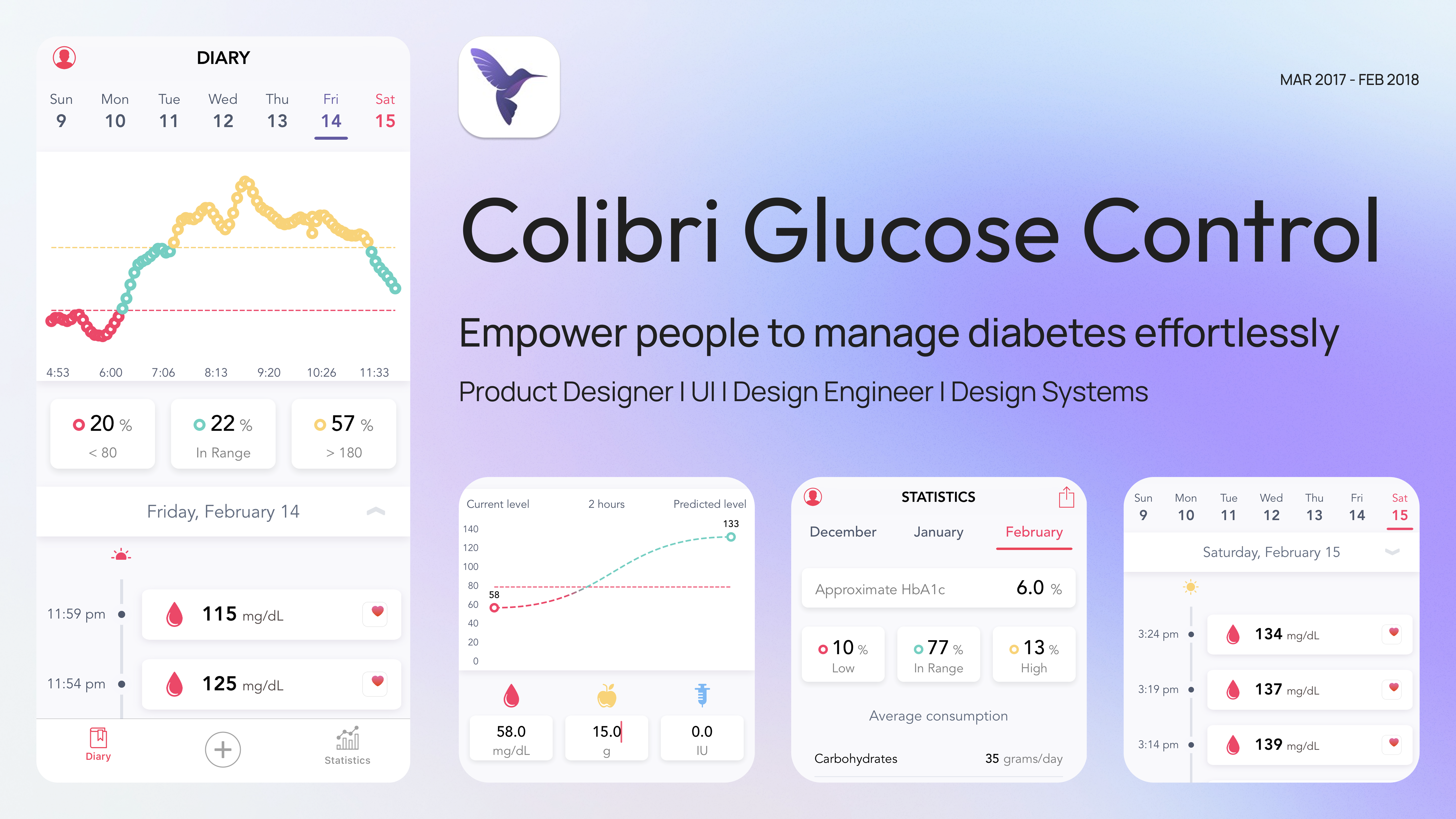
ColibriGC empowers insulin-dependent users to manage diabetes effortlessly. It logs glucose readings, carbohydrate intake, and insulin consumption; calculates dosage in real time; and surfaces long-term trends — turning a daily mental-arithmetic burden into a glanceable, actionable workflow.
Managing diabetes means balancing glucose, carbs, and insulin every day — but the existing tools made dose calculation slow, error-prone, and impersonal. Dashboards were dense, personalization was thin, and trend analysis was missing. Errors here aren't just inconvenient; they're medical.
“How might we simplify insulin dosage calculation while giving users actionable insights into how their body responds over time?”
Real-time dose calculation based on current glucose and carb intake, paired with a predictive glucose graph showing the expected post-meal trajectory.
A single screen to log glucose readings, carbs, and insulin — with immediate, actionable insight on each entry instead of raw numbers waiting to be analyzed.
Three-month visualizations with averages designed to be screenshot-ready for medical appointments — the conversation with a doctor starts with data, not memory.
Insulin-to-carb ratios are unique to each person. The settings let users tune the calculator to their own body, instead of forcing a generic profile.
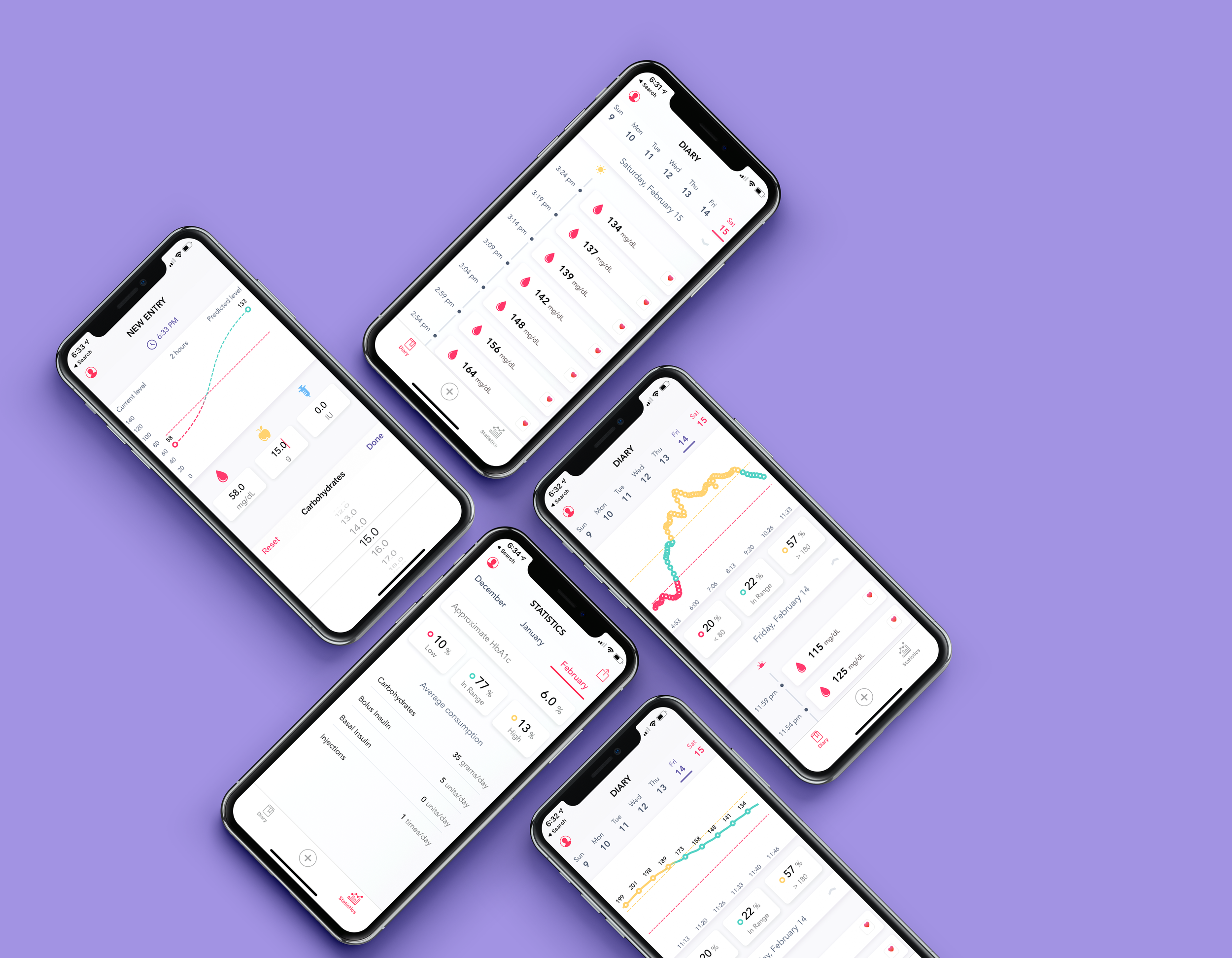
The four features at a glance: calculator, diary, statistics, and personalization on a single canvas.
I started with moderated interviews of insulin-dependent users [NEEDS: sample size + demographic mix] and a competitive audit of the diabetes-management apps already on the store. The same three pain points surfaced across every conversation: dose-calculation accuracy, personalization (the existing tools assumed everyone had the same insulin-to-carb ratio), and on-the-go usability (the apps were designed for a calm desk, not a restaurant table mid-meal).
Errors here aren't inconvenient — they're medical. Dose math had to become the design's job, not the user's burden. Every subsequent decision (the calculator's live readout, the predictive glucose graph, the personalised insulin-to-carb ratios in settings) worked back from this single framing.
From low-fi wireframes I built an interactive prototype with live calculations and a predictive glucose graph, then ran moderated usability testing with ten participants. Task completion, error rates, and satisfaction scores drove a final round of iteration before launch — and became the headline pre-launch metrics on the outcomes panel below.
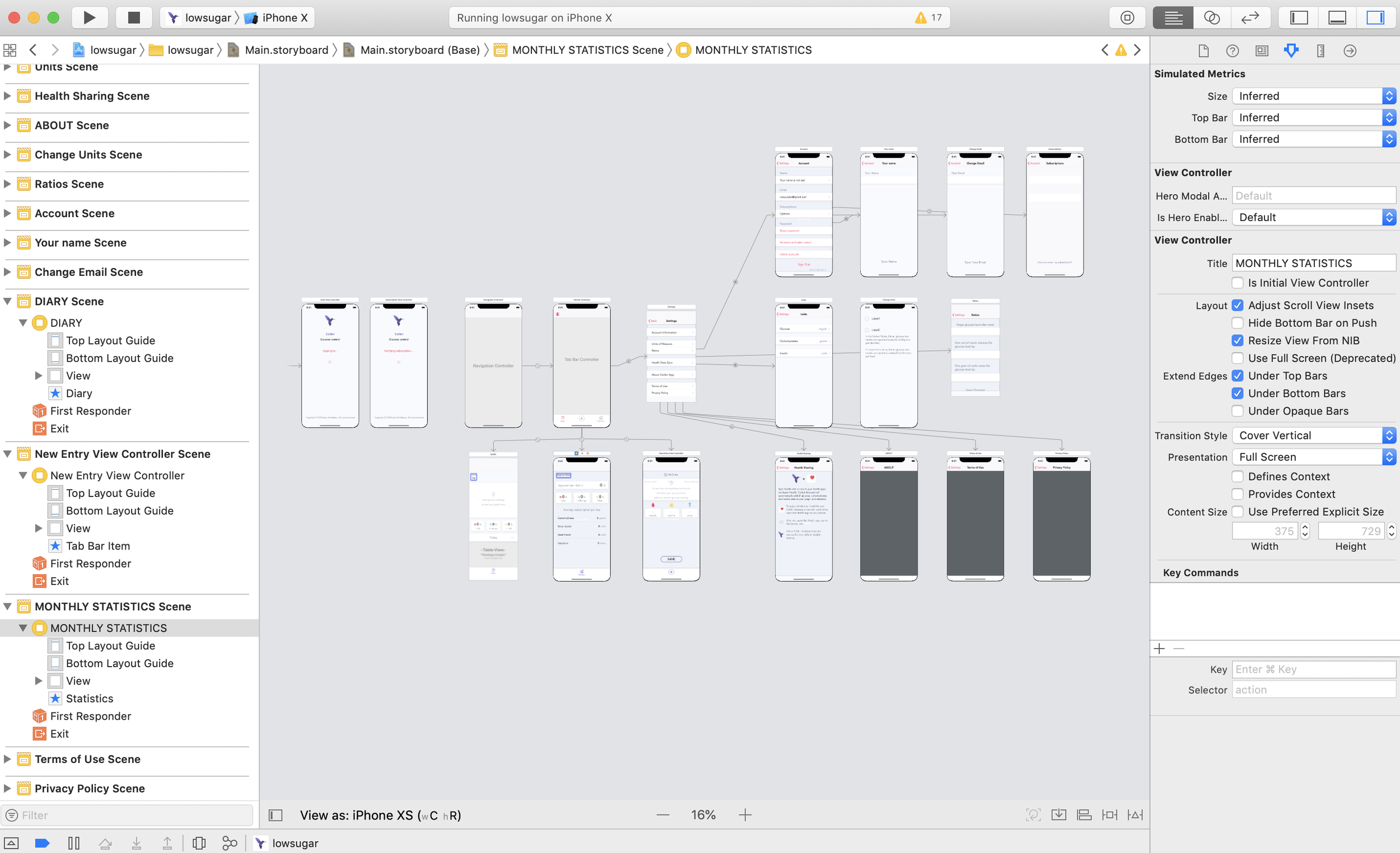
From low-fi wireframes to the interactive prototype that drove usability testing — and into the handoff package the iOS partner team built against.
“Finally a diabetes app that does the math for me instead of making me redo it on my phone calculator at the dinner table.”
“ColibriGC was the project that taught me design has stakes. When someone is dosing insulin off your interface, clarity isn't a preference — it's the deliverable. The lessons from this work shape how I approach every product since.”
ColibriGC is no longer maintained or available on the App Store. The case study is preserved here as a record of the work.