01
Digital Logbook
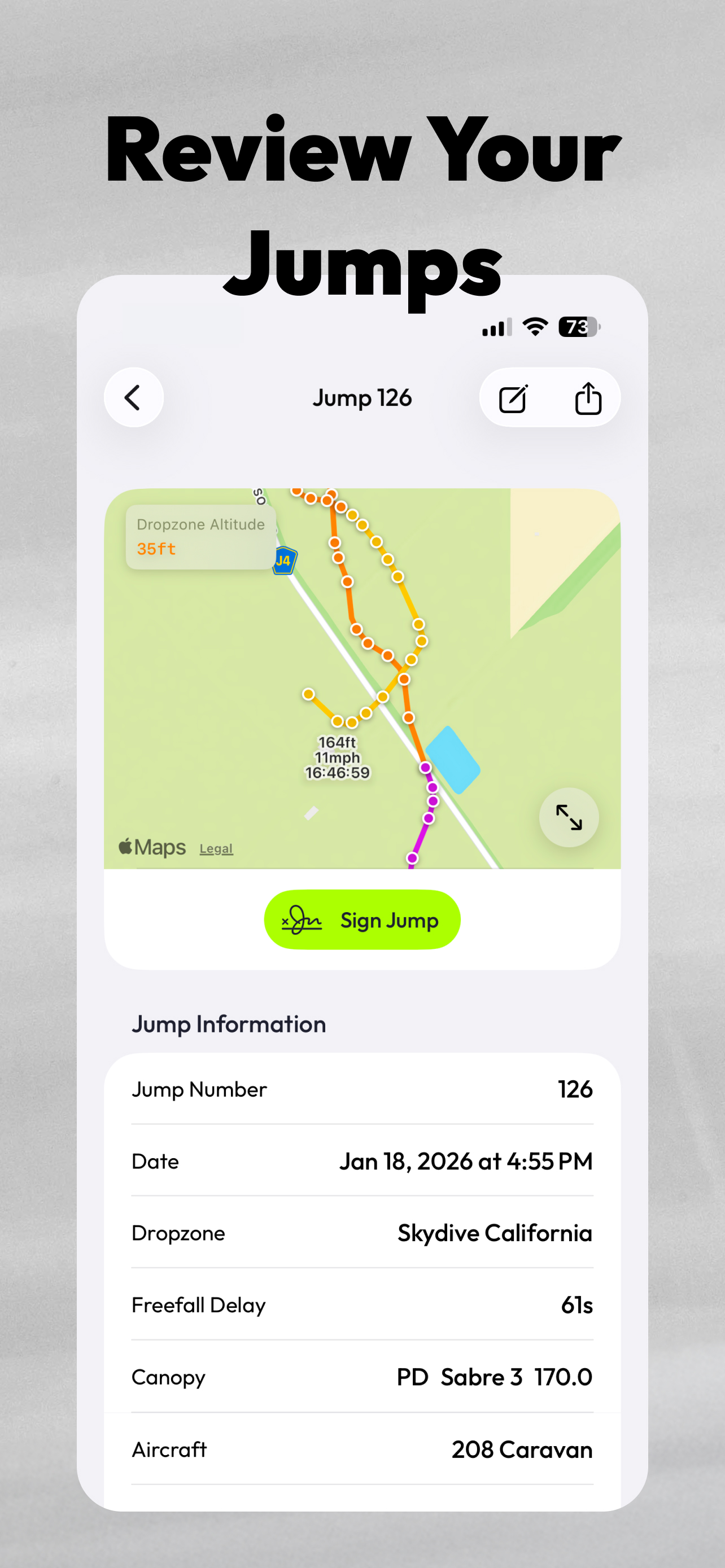
Every jump is organized, searchable, and stored on device — aircraft, dropzones, gear, notes, photos, and signatures captured in seconds. No pen required.

A production iOS and macOS app I designed and developed for skydivers to track jumps, review landing patterns, and manage their records across mobile and desktop — including the in-app design system, built in SwiftUI as a reusable package. Every jump counted. Every pattern tracked.
SkySavage serves two audiences: new licensed skydivers learning to improve their landings, and advanced athletes who want to log jumps faster without giving up the depth of data they rely on. It covers the logbook, landing-pattern review, and cross-jump stats on iOS and macOS — designed and developed end-to-end.
Skydiving is task-specific and time-critical. The interface had to present information that was easy to scan, actionable, and easy to review over time — not just in the moment of logging a jump, but weeks later when someone reviews their patterns and refines technique. Clarity wasn't a nice-to-have. It was the brief.
“I didn't treat the UI as a collection of one-off screens. I treated it as a system — with reusable components, shared logic, and implementation-ready patterns.”
Before writing a line of SwiftUI, I ran moderated interviews with 27 skydivers across the experience curve — from a B-license student with 80 jumps to a Safety & Training Advisor with 1,700+ — including current paper-logbook holdouts, club organizers, canopy course participants, and instructors who debrief students daily.
Three findings repeated across nearly every conversation. Paper logbooks get lost, forgotten, or left at home — and skydivers know it, but the digital alternatives feel too rigid, get discontinued, or require pulling out a phone mid-jump, which no one will do. Landing-pattern disputes are a recurring safety problem — without objective data, the post-landing argument at the drop zone goes unresolved. And review for progression is broken today — even experienced jumpers can't easily compare canopies, track high-performance turn altitudes, or see their patterns over time.
Landing-pattern visualization had to be the killer feature — not a nice-to-have. The same ask came up independently across the sample: from instructors who debrief students, from license holders refining their canopy work, and from club organizers who wanted GPS evidence for landing-pattern disputes. Every other decision about the product worked back from this one.
During early prototyping I tested two navigation directions side by side and walked potential users through both. The first was a native iOS bottom tab bar — the safe, familiar choice. The second collapsed navigation into a left sidebar and kept the logbook on the primary surface at all times.
The feedback was consistent across the sample: skydivers wanted the logbook to be the app, not one tab among four. The sidebar variant won on three counts — fewer taps between opening the app and starting a jump, less chrome competing with the data, and a mental model that scales cleanly from iOS to macOS, where a sidebar is the native pattern anyway. The final UI carries the same vocabulary across surfaces; the macOS sidebar IS the iOS sidebar, just sized for the device.
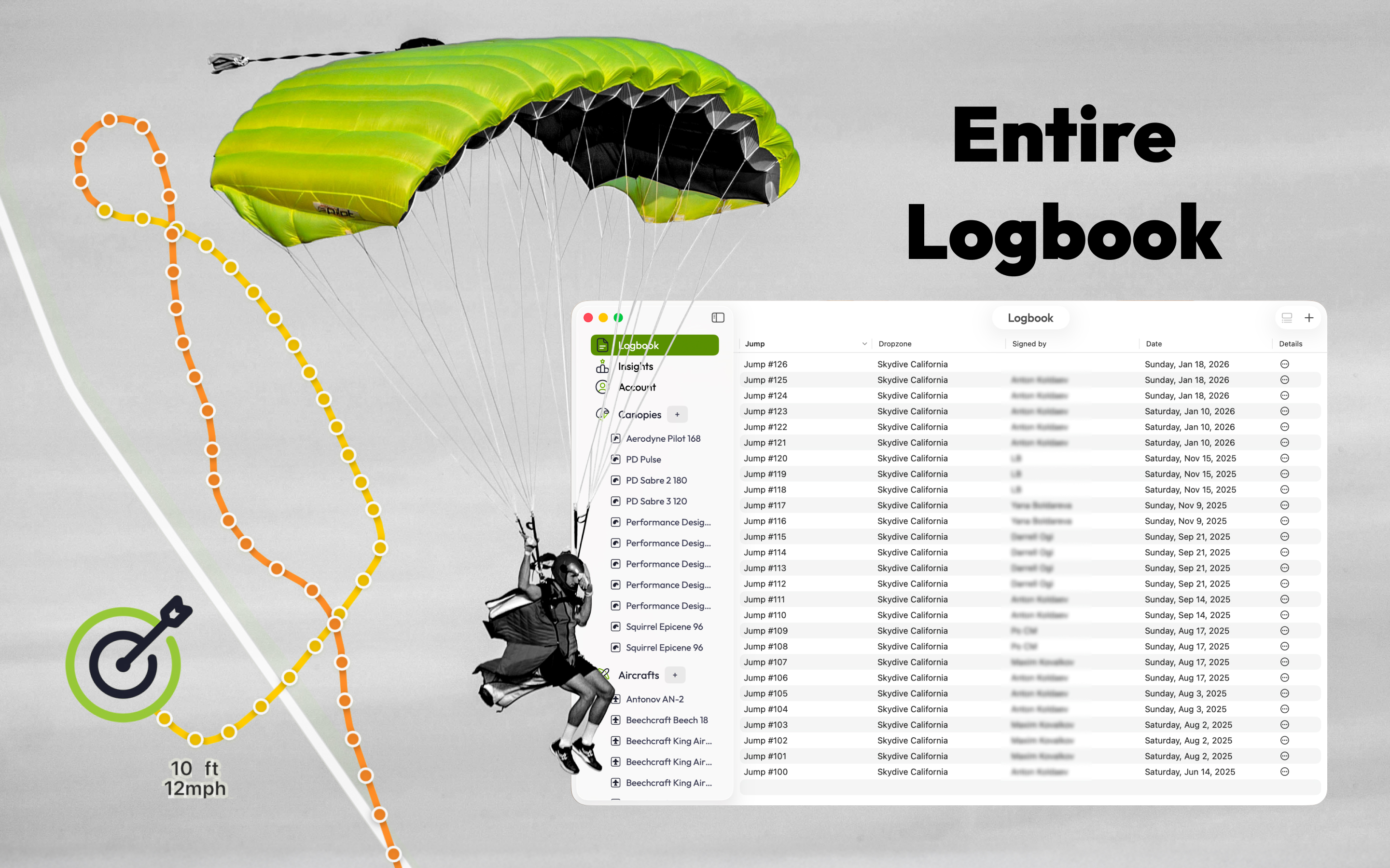
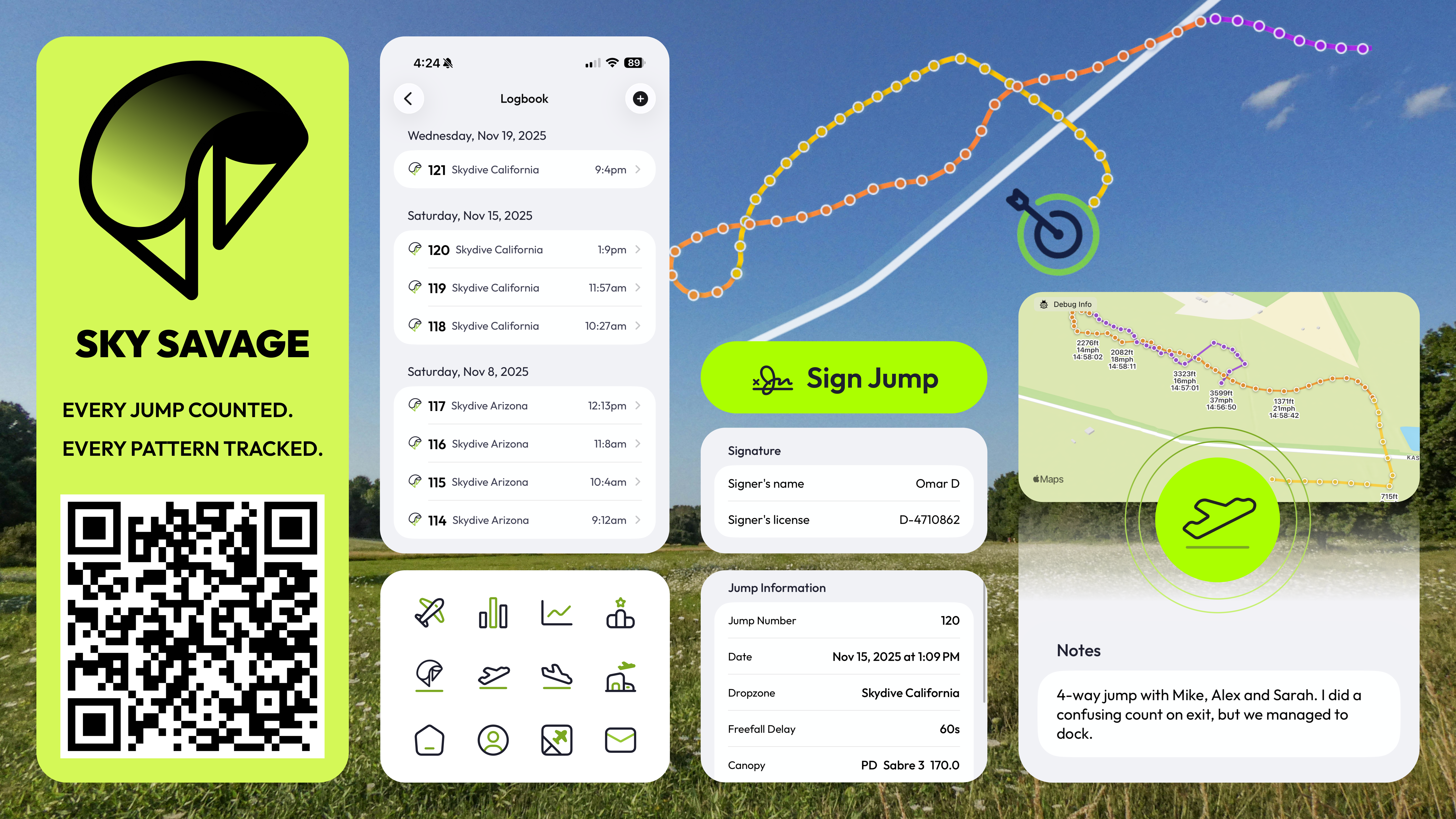
Every jump is organized, searchable, and stored on device — aircraft, dropzones, gear, notes, photos, and signatures captured in seconds. No pen required.
The canopy flight tells a story. Visualized landing patterns help skydivers spot mistakes, refine technique, and become safer, more consistent canopy pilots — and settle the occasional dropzone debate along the way.
Review flights on a larger screen, add or edit entries, analyze patterns, plan the next trip. The desktop experience shares the same design system as iOS but defers to native macOS interaction patterns.
The killer feature, surfaced by every user interview, gets a dedicated surface of its own. Each jump's canopy flight is recorded as a GPS track and rendered on the dropzone map — the spiral down, the speed at every waypoint, the altitude above ground, the moment of touchdown.
The same view doubles as evidence in landing-pattern disputes and as a teaching tool for canopy courses. "Show me what you did" stops being a memory exercise.
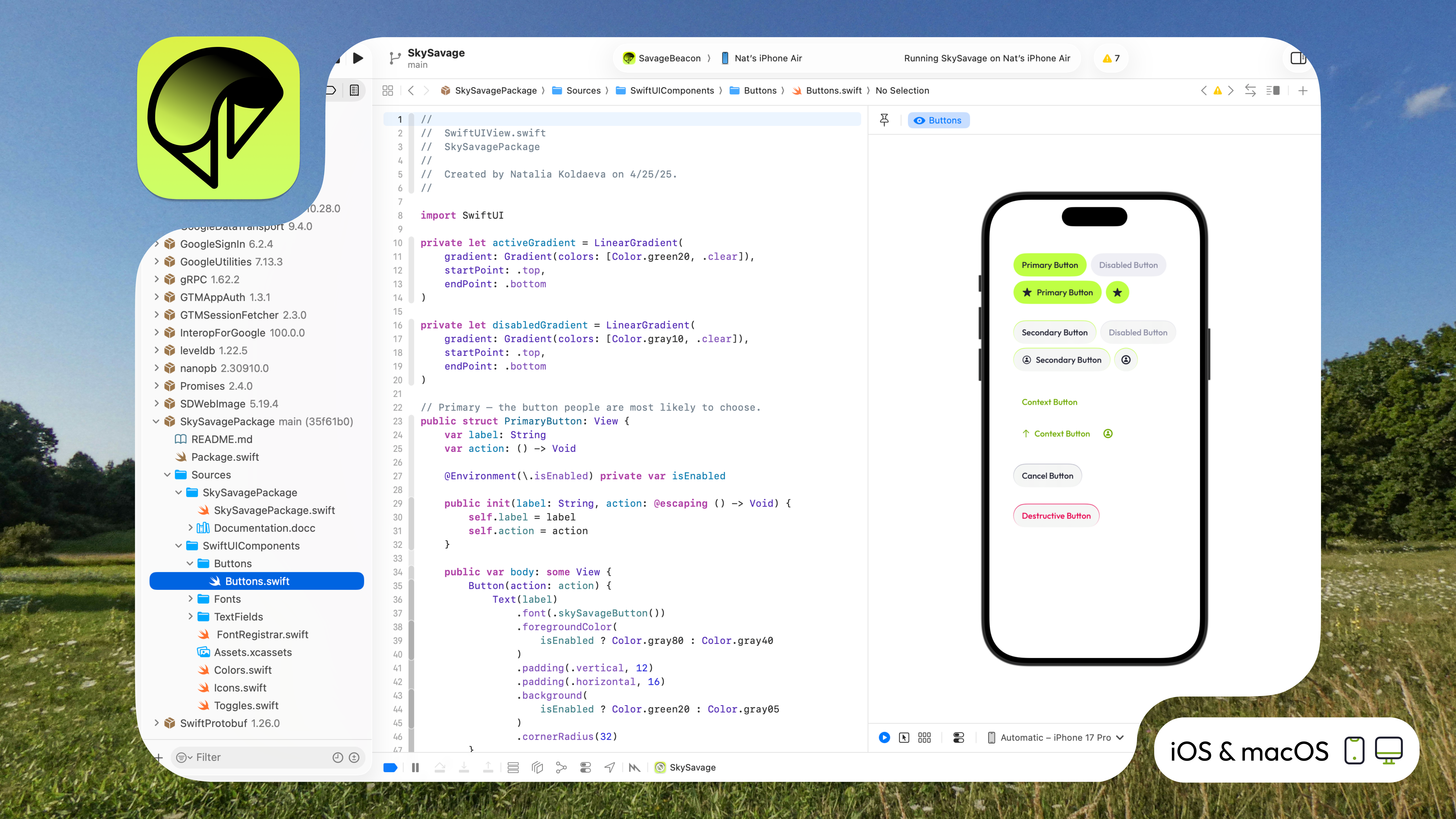
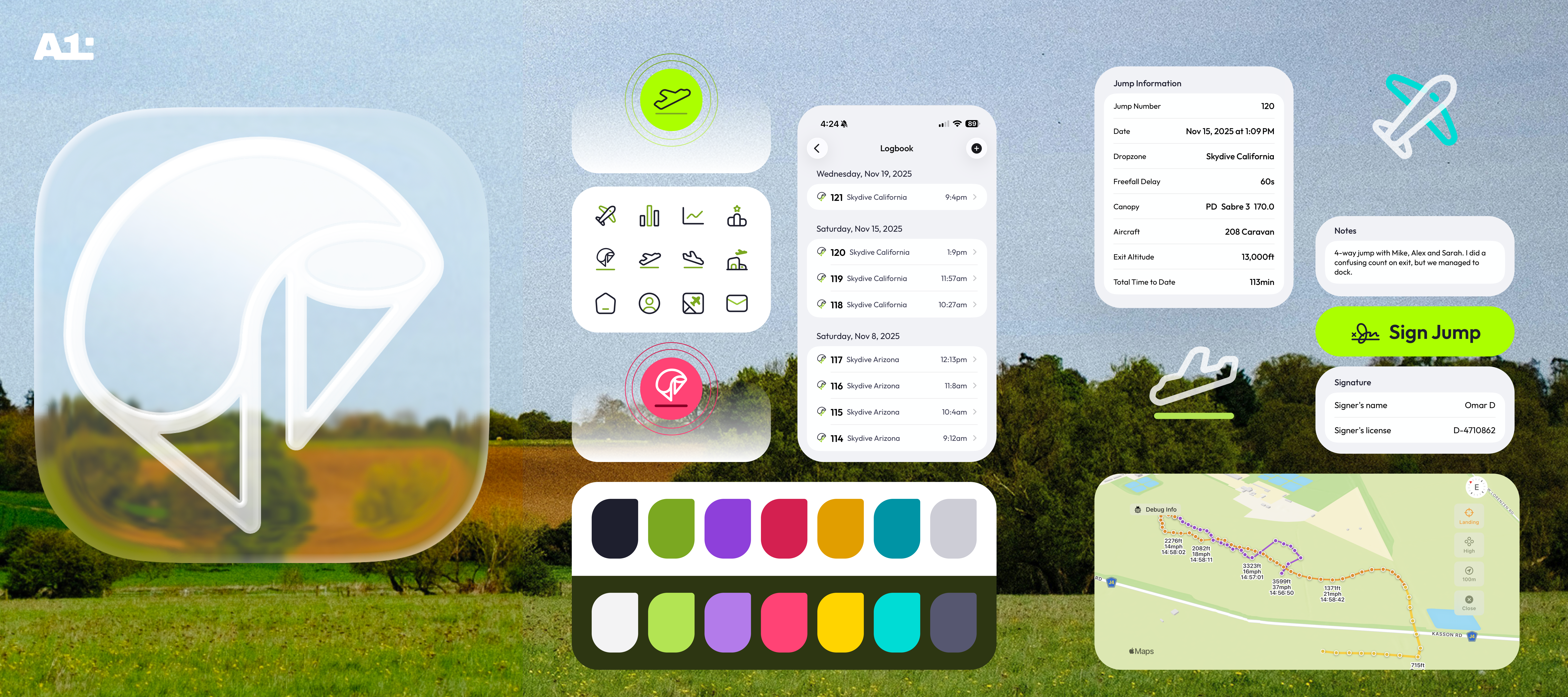
Because I designed and developed the product myself, the in-app design system lives inside the codebase as a reusable SwiftUI package. That forced me to think beyond individual screens — focusing on native behavior, component consistency, implementation quality, and how the experience scales across surfaces. Buttons, typography, color tokens, icons, and form controls all ship from a single SwiftUI source.
The same product runs on iOS and macOS — but it's not one product squeezed into two windows. Components and logic are shared via the design-system package; layouts, interactions, and chrome defer to what each platform expects. I had to think beyond a single phone UI and consider how the experience should translate across devices while still feeling native to each surface.
As the prototype came together, I showed it during the same interview sessions — testing whether the design decisions held up once users actually saw them. The reception was strongest around the landing-pattern map, which several interviewees said matched what they'd been doing manually for years: screenshotting altimeter data, marking up paper logbooks, and trying to reconstruct the canopy flight from memory.
USPA approval came mid-development. Multiple interviewees opted in to test the live app before public launch, and their feedback — mostly small UI corrections, a few feature requests around video and drop-zone integrations — informed the 1.0 release.
“The automatic landing-pattern capture is what I've wanted in a logbook for years. Tools like this could change how we debrief students.”
“A strong example of the intersection between visual craft, systems thinking, and close alignment with engineering — the work I lean on when I want to show how I think about design as a system, not as screens.”