01
Weekly act library
A curated list that refreshes every week — categorized by love language and grouped into tiers of complexity. Small gestures, mid-effort acts, and larger projects partners plan together.
A consumer iOS app that enriches relationships through personalized acts of love — structured around the five love languages and refreshed weekly. Designed, prototyped, and shipped end-to-end in SwiftUI over eight months, from concept to App Store launch.
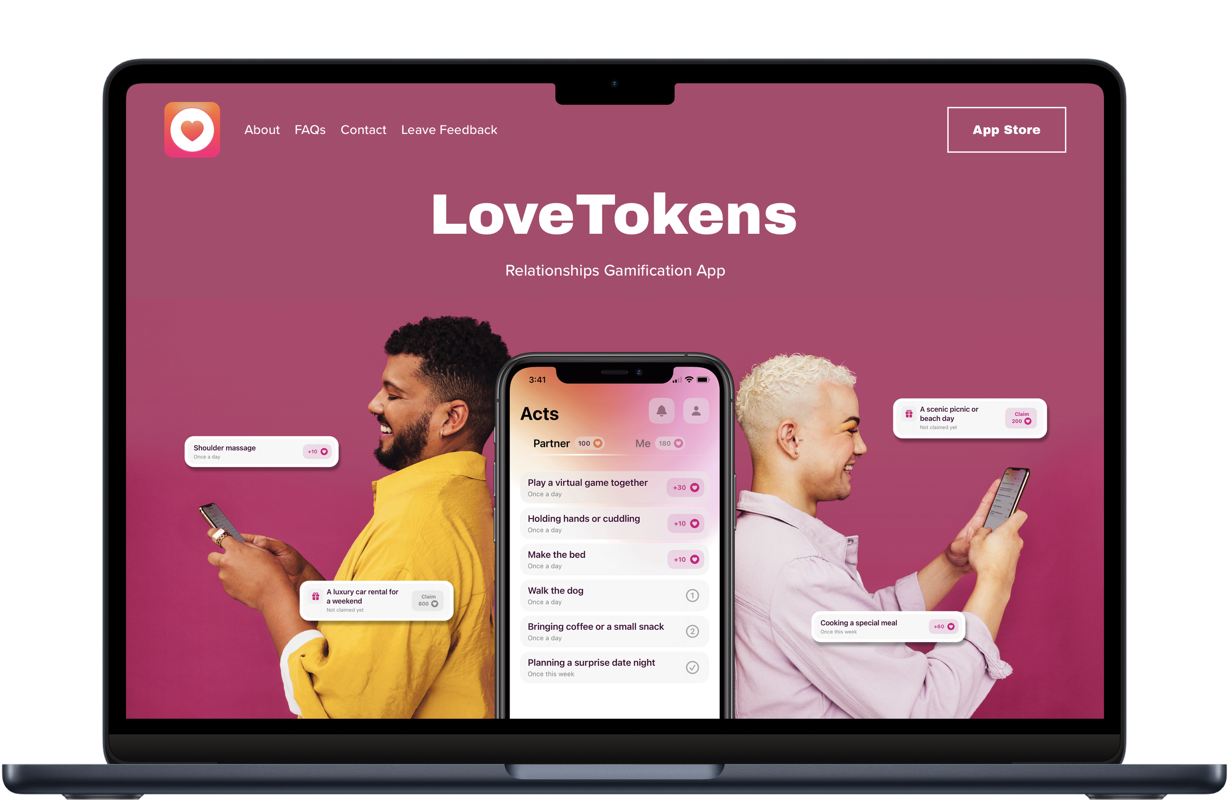
LoveTokens helps couples translate intention into action. Each week the app refreshes a curated list of small, meaningful acts — categorized by love language and grouped into tiers of complexity — so two people can offer each other something deliberate, not improvised. Partners pair their devices with a QR code, then move through the acts together, approving each other's completion.
Romance products lean on the same visual vocabulary: pinks for women, blues for men, lots of red. I wanted LoveTokens to do the opposite — to feel inclusive of every kind of couple. The color palette, typography, and the language of the interface were deliberate choices to step out of those defaults and make the product feel at home for LGBTQ+ users as much as anyone else.
“Love is diverse. The product had to be too — not as a marketing line, but as a system: in the color palette, the language, the onboarding, and the way two people use it together.”
In a world where color often conveys stereotypical gender roles, I wanted LoveTokens to embrace diversity. Because of that constraint, I experimented with different color combinations, trying to mirror the richness and diversity of love itself.
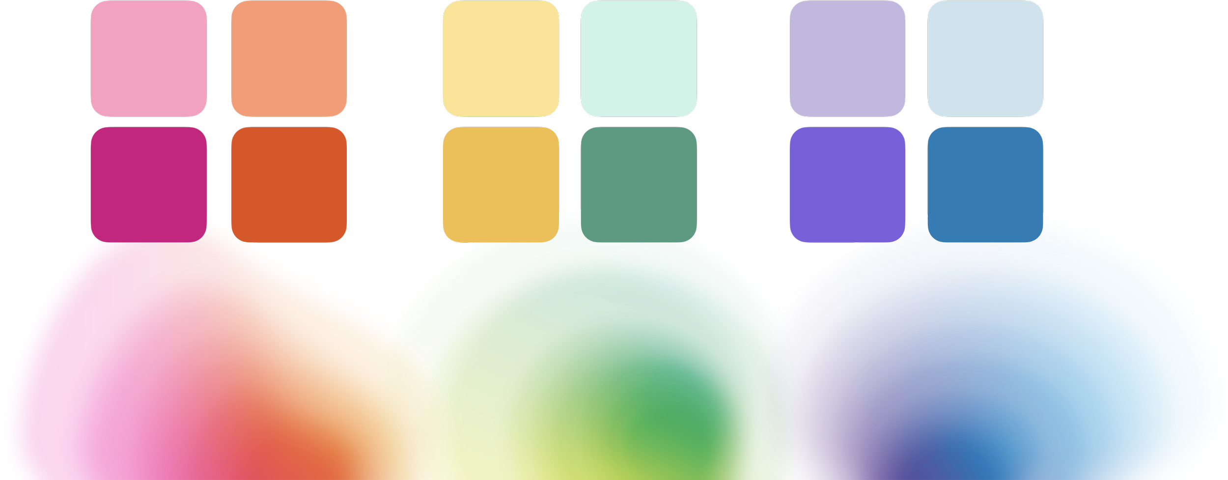
Exploring color combinations beyond the pink/blue defaults of romance apps.
A curated list that refreshes every week — categorized by love language and grouped into tiers of complexity. Small gestures, mid-effort acts, and larger projects partners plan together.
Couples pair their devices with a QR code — no account dance. As acts get completed, partners evaluate and approve each other's work, turning the app into a shared feedback loop rather than a private checklist.
An interactive, skippable onboarding teaches the model without lecturing. Light and dark mode were designed together — every component, every color pairing — and the whole experience meets WCAG AA contrast and accessibility standards.
Five flows carry the heart of LoveTokens — from first-run onboarding to the daily loop of adding and approving acts. Each was designed and built in SwiftUI, tuned against the inclusive color system and full light/dark support.
I wanted onboarding to paint a vibrant, interactive picture of LoveTokens. People can playfully engage with samples of key UI elements, or swiftly skip ahead to begin their journey — it's all about the user's preference.
The magic of LoveTokens truly unveils when two people connect. Through a simple QR-code scan, couples pair their devices, seamlessly blending their digital experience.
For the add-acts flow, I introduced categories that reflect the different love languages and tiers that measure each act's complexity. This structure sets fair expectations and fosters a balanced relationship dynamic.
When an act is marked complete, the other partner evaluates it. Approving acts lets couples acknowledge each other's contributions and build a dialog of transparency — and an act can be declined if it was completed below expectations.
LoveTokens transitions seamlessly between light and dark modes based on the device's settings. I design every UI component for both appearances from the start, making sure each one accommodates the other rather than retrofitting it later.
Like every product I build, LoveTokens has an in-app design system in SwiftUI. I designed and developed the app myself, so the visual language and the SwiftUI code were never separate streams of work. Components shipped from the same source the screens used; light and dark mode were one design problem; accessibility wasn't a retrofit — it was the brief.
Onboarding was the riskiest surface — it had to teach the love-languages model, set up the partner pairing, and keep the tone playful, all in a single sitting. I ran three rounds of moderated usability testing before launch, iterating between each round on the language, the pacing, and the QR-pairing flow.
Across the three rounds, onboarding drop-off fell by 30% — the headline pre-launch metric and the one I trust most, because it was earned in front of real users rather than measured after the fact. [NEEDS: sample size per round + the single biggest change between rounds, if you want them surfaced explicitly.]
“Finally a couples app that doesn't feel like it was made for someone else's relationship. The visual choices are the first thing I noticed — it actually looks like it belongs to us too.”
“LoveTokens reinforced how much of design lives at the intersection of craft, code, and emotion. The visual choices and the engineering choices weren't two separate jobs — they shaped each other, and the product is what came out the other side.”