
Numerade Navigation Redesign
A research-led navigation redesign for Numerade's iOS and Android app — an AI-powered learning platform for high school and college STEM students. From heuristic evaluation through A/B testing to shipped product, the work surfaced core actions in a new top navigation bar and unlocked 175% MAU growth, 3× retention, and 70% revenue surge.
Team and role.
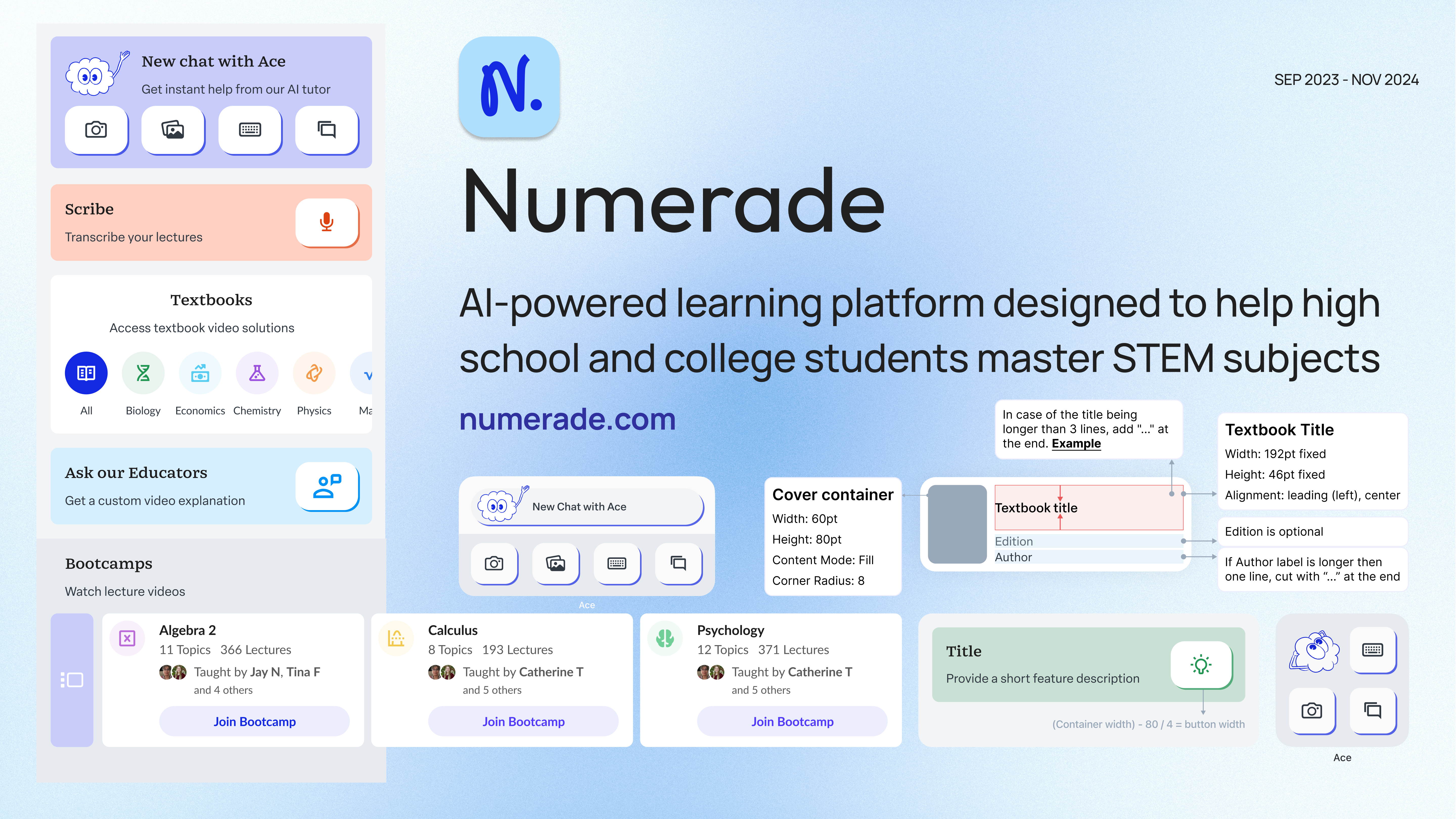
An AI-powered learning platform for STEM students.
Numerade helps high school and college students master STEM subjects through an AI-powered learning experience — short video walkthroughs, step-by-step practice, and a growing library of textbook solutions. Used across iOS and Android by hundreds of thousands of learners.
An app struggling with engagement and conversion.
Only 24% of users returned after their first session. Existing flows had layered hierarchies, persistent tab bars cluttering the screen, and core features buried where new users couldn't find them. The app had the content; the navigation hid it.
“Make key features easily accessible to improve engagement.”
Heuristics first, then three concepts.
I assessed every critical flow against usability, design consistency, and performance heuristics, partnering with the Director of Product, Lead Developer, engineers, PMs, and researchers. From the audit I shaped three navigation concepts — each a different bet about how users should reach the product's core actions — to put in front of users instead of debating them in a meeting.
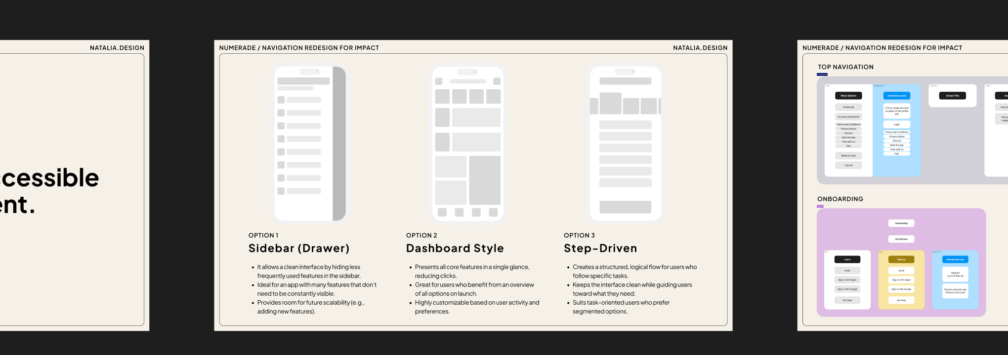
A/B tested before it shipped.
Participants located features faster — especially the AI Assistant and My Library — and described the new structure as simpler and more purposeful. The test settled the direction with data, not opinion.
Showcasing what the app could do.
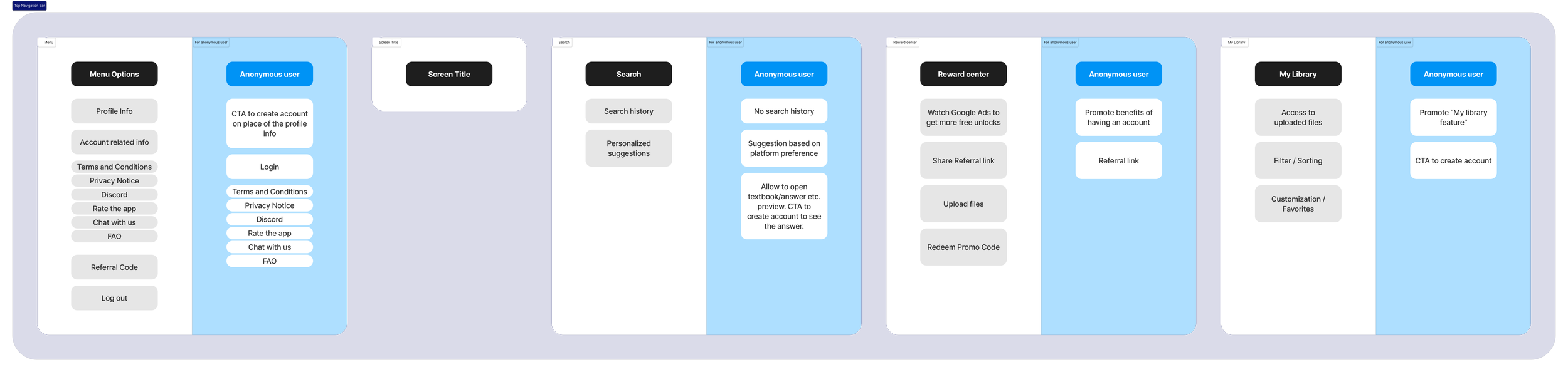
Aligning information architecture (IA) with the user journey. I designed information systems that are user-centered, scalable, and adaptable — built to evolve alongside the people using them.
The top navigation bar carries feature previews and platform highlights into the home view — discovery and depth on the same surface.
Navigation that puts core actions in the home view.
The redesign integrates core actions directly into the home screen via a top navigation bar — replacing a layered drawer with a surface-first model. Users see what the app can do the moment they open it; nothing critical hides behind a menu tap.
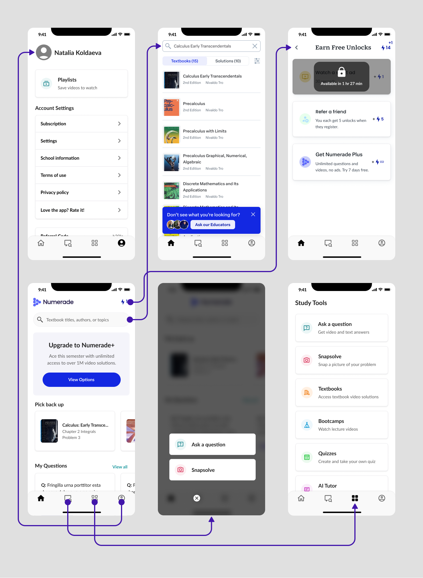
Before — core actions buried behind a drawer menu.
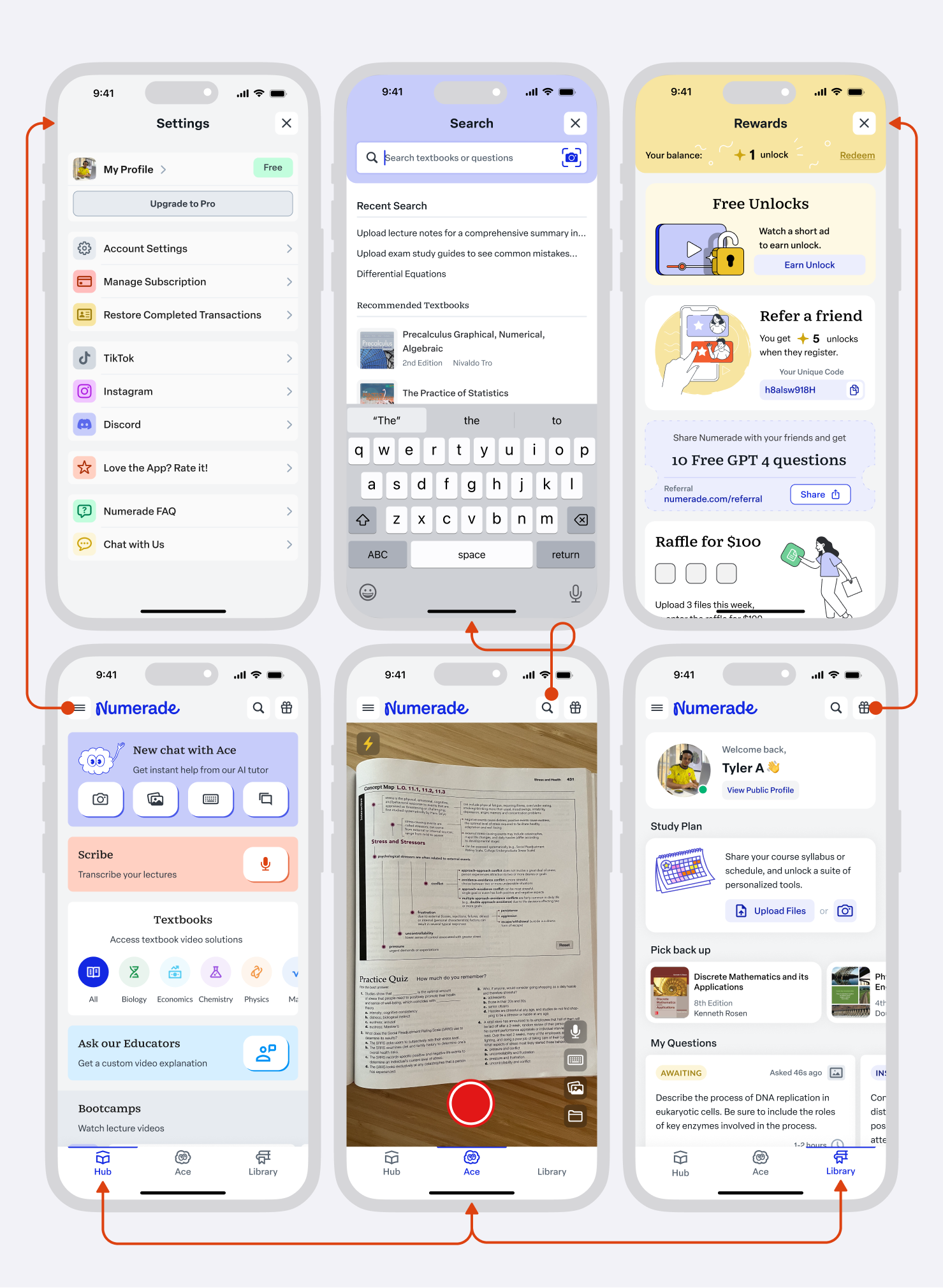
After — the new top nav surfaces the core actions on the home screen.
Six problems, six paired solutions.
Alongside the navigation change, I worked through the rest of the app surface-by-surface, pairing each legacy problem with an explicit design intent — and validating each with engineering, product, and research before shipping. Six surfaces, six before/after pairs.
Complex hierarchies → Simplify and empower.
Flattened deep parent-child structures so users could reach what they needed without stepping through layers of context.
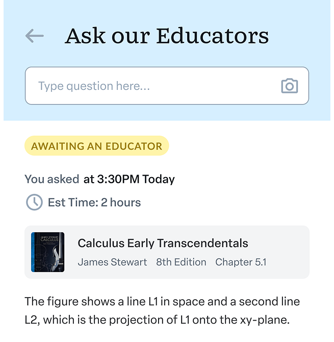
Before — complex hierarchies.
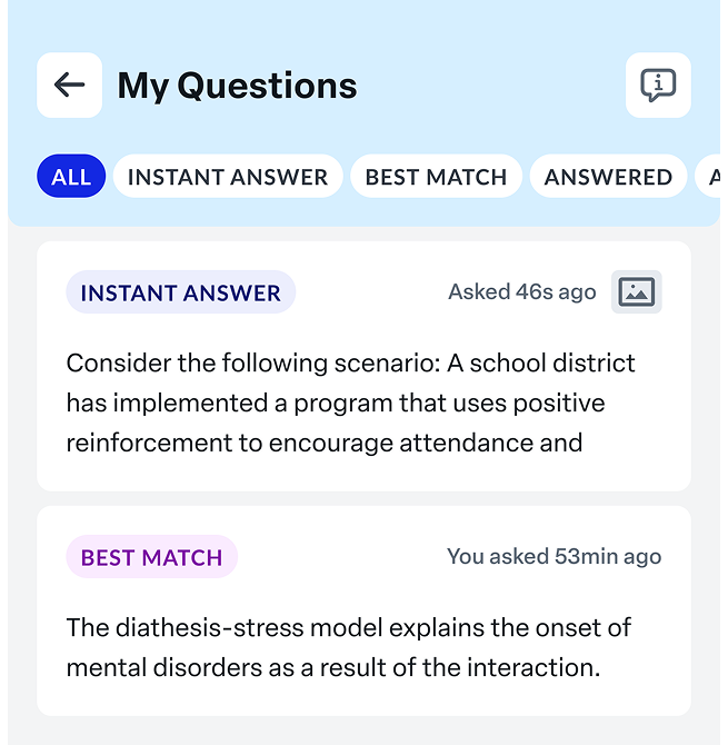
After — simplify and empower.
Lack of clear return paths → Instill confidence.
Added consistent back affordances and breadcrumb logic so users always knew where a tap would take them — and how to get back.

Before — unclear return paths.
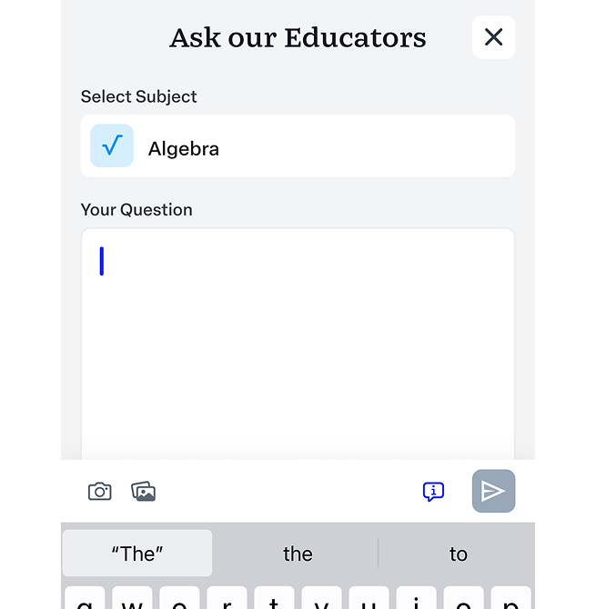
After — instill confidence.
Overuse of persistent tab bar → Reduce clutter.
Audited the tab bar against actual usage data and removed low-value tabs, freeing screen real estate for the content users came for.
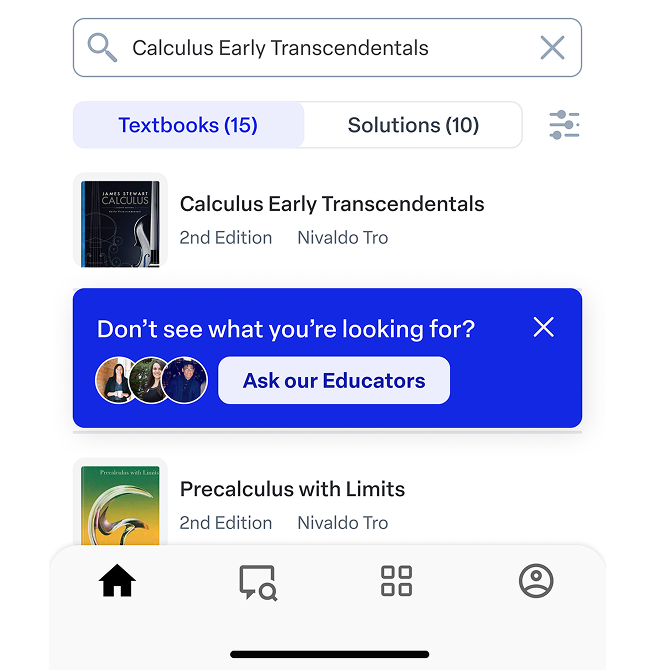
Before — overused tab bar.
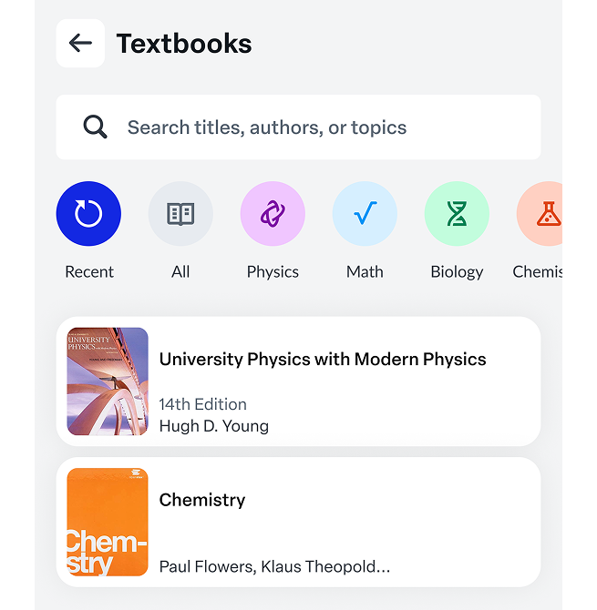
After — reduce clutter.
Insufficient use of modal views → Focus user attention.
Reserved modal views for moments that deserved them — quick tasks, confirmations, focused inputs — so the underlying context stayed intact.
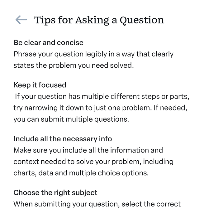
Before — modal views underused.
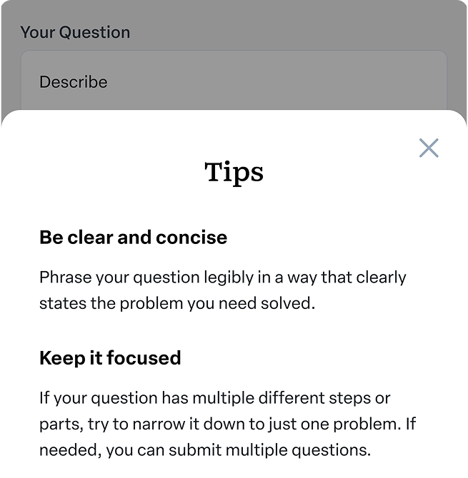
After — focus user attention.
Poorly placed features → Improve discoverability.
Moved high-intent features (Ask Educators, Save, My Questions) up the hierarchy where users could see them, not down where they had to dig.
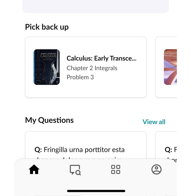
Before — features buried.
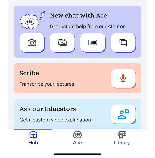
After — improve discoverability.
Inconsistent navigation → Build a unified experience.
Standardized navigation patterns across surfaces — same logic, same affordances, same expectations across iOS and Android.
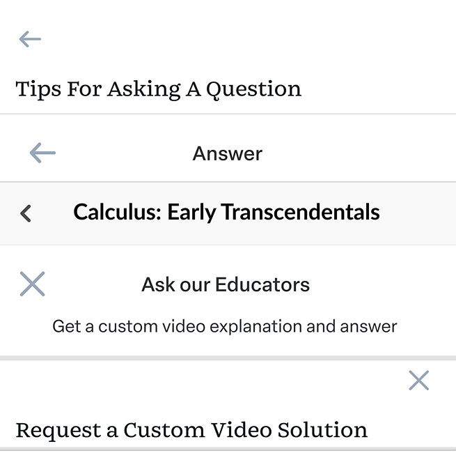
Before — inconsistent navigation.
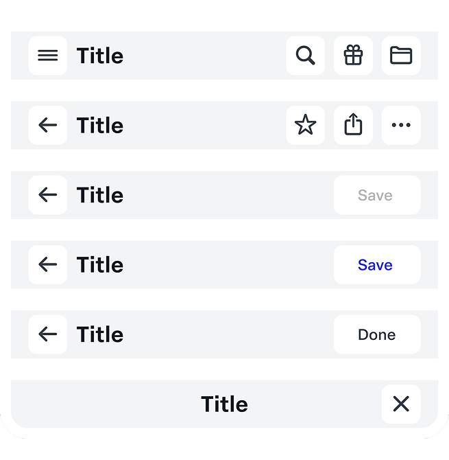
After — build a unified experience.
A shared reference for design and engineering.
The redesign needed a foundation that could outlast it. I developed a design system as a shared reference point for designers, engineers, and stakeholders — improving team productivity and pulling consistency across the app from "intent" to "default." It became the quiet engine behind the user-facing wins below.
What shipped, what moved.
Tools and methods.
“One structural change — surfacing core actions in the home view — compounded across retention, ratings, and revenue. The biggest lesson wasn't the design itself; it was the discipline of testing the choice before believing it.”