
VISVA — Redefining Reactions
A reaction-system redesign for VISVA, a social platform built around meaningful connection without the pressures of mainstream social media. The work replaced traditional emoji reactions with culturally relevant "Vibes" — a Gen-Z-native vocabulary that lifted post-reaction engagement from 18% to 45%, raised NPS by 15 points, and shortened the AI personalization curve by 33%.
Team and role.
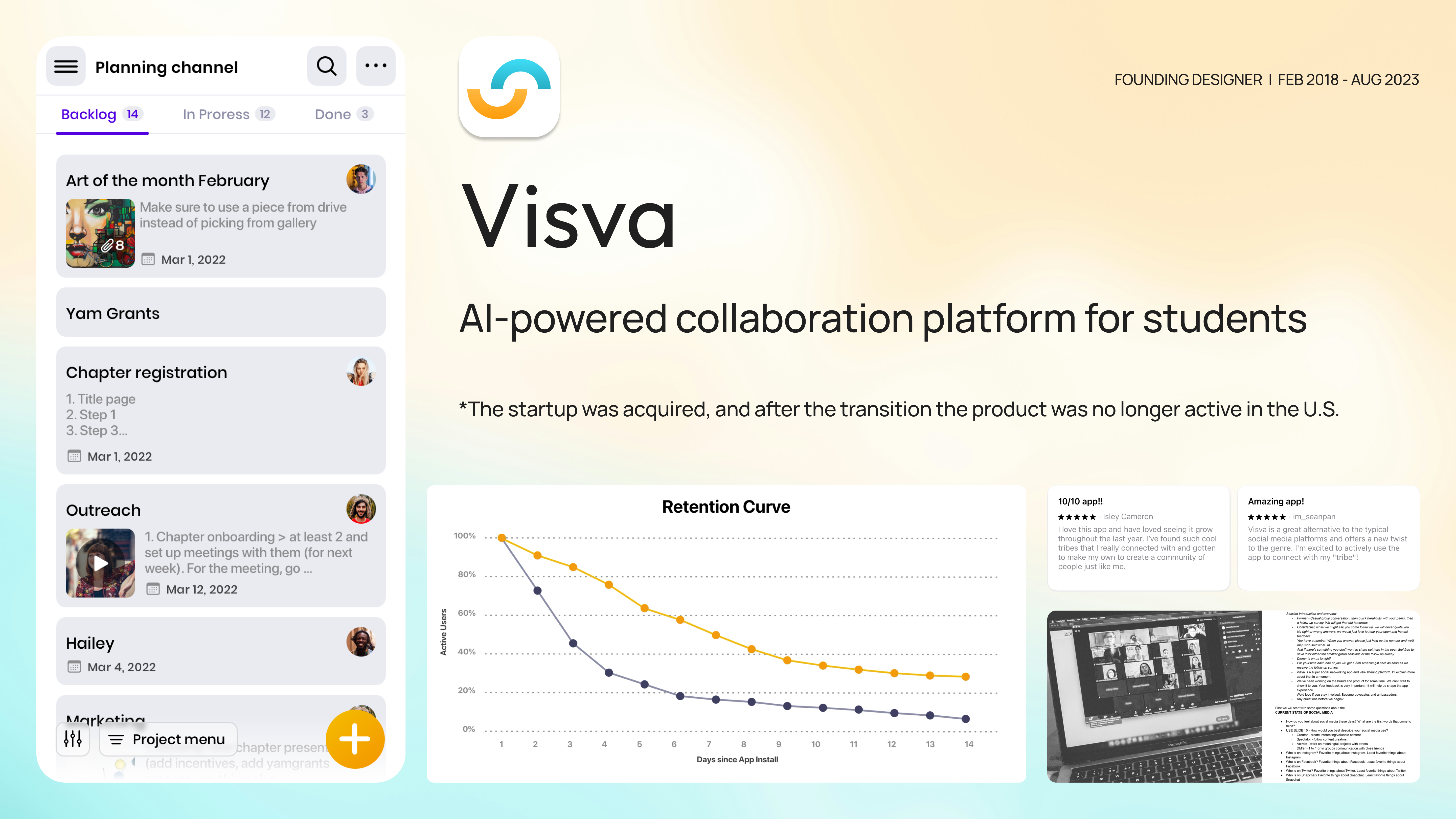
A Gen-Z social platform built for meaningful connection.
VISVA is a social platform built to connect people meaningfully — without the performance pressure of mainstream feeds. The audience is Gen Z: teens and young adults who want a place to express themselves emotionally in language that actually sounds like them, and to be matched with content that responds to how they feel, not just what they click.
Reactions weren't moving the needle.
Only 18% of users reacted to posts after reading them. That low signal didn't just dampen the feed — it directly slowed the AI personalization model, which depended on reaction data to learn what kind of content each user wanted to see. The reactions were generic; the audience was anything but.
“Lift post-reaction engagement by at least 15%, shorten the AI's learning curve, and make reactions feel like Gen-Z language — not a translation of one.”
Mapped the audience before changing the surface.
I started in the engagement data and the existing user research, then built a sharper picture of the Gen-Z user behind the reaction: who they are, what they're trying to express, and which mainstream patterns feel borrowed to them.

To validate the hypothesis that mainstream reactions were the wrong vocabulary, I ran an exploratory prototype with Facebook-style reactions against a unique set: 90% of participants preferred the unique reactions. From there, ten-plus hours of card-sorting sessions with fifteen Gen-Z teens mapped which emotional cues felt native versus borrowed, and gave us the raw vocabulary for what eventually became "Vibes."
The audience tells you what to ship if you ask them in their own format. Card sorts answered the design brief the product team couldn't — the vocabulary had to come from the users, then the system, then the design.
From "Kudos" to "Vibes."
The concept moved through three named iterations — each one tested against the same question: does this sound like how a 16-year-old actually reacts to a post they like?
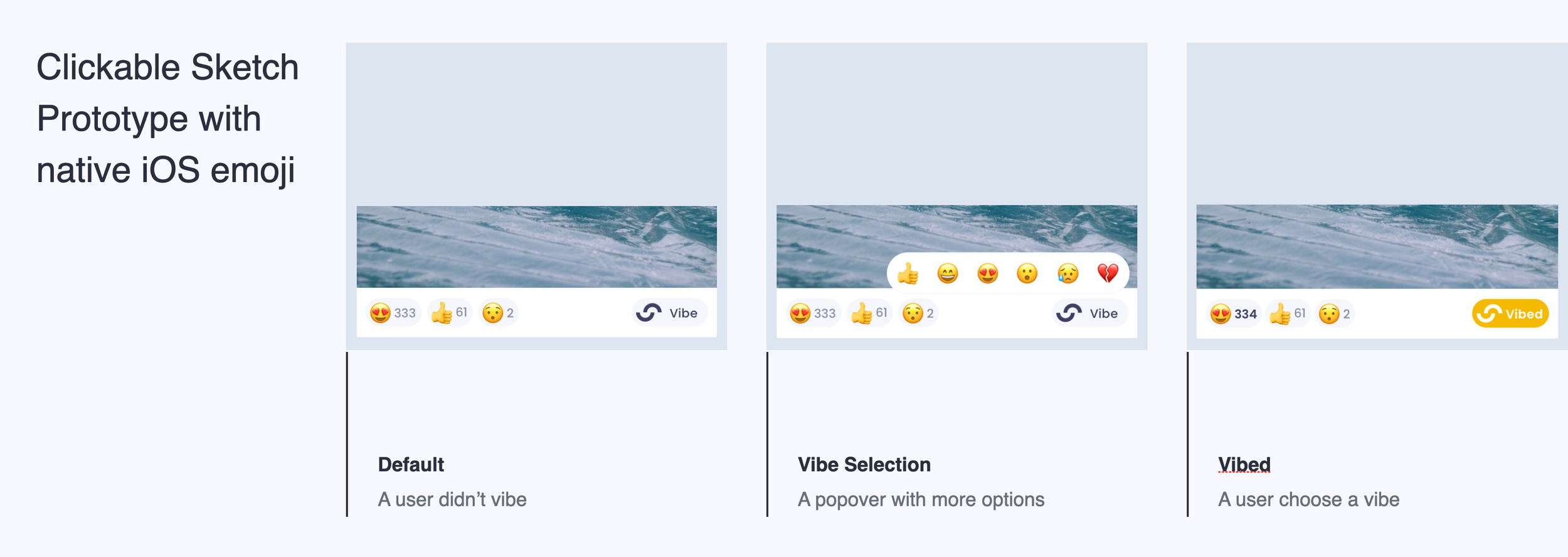
01 · First concept — moving away from the borrowed reaction set.
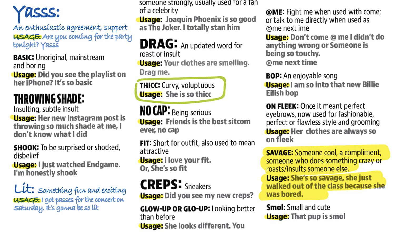
02 · Gen-Z slang exploration — mapping the words teens actually use.
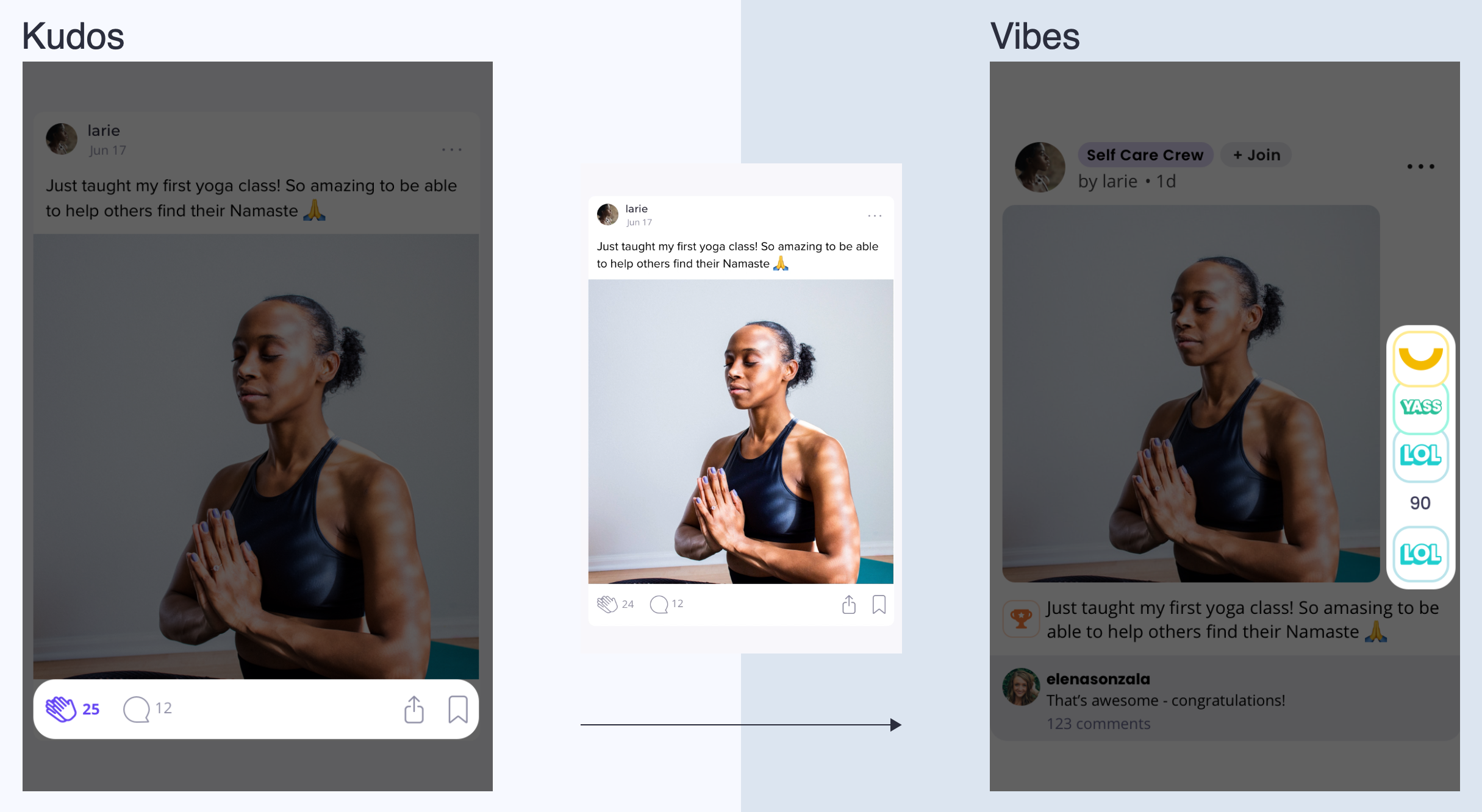
03 · Naming the system — "Kudos" felt earned, "Vibes" felt true.
The redesign was reading too "generic social."
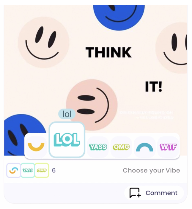
A mid-stage layout regressed VISVA's distinct identity: platform-uniqueness perception dropped 45% in usability tests. The design was clean and modern — and indistinguishable from any other social feed. Clean isn't a differentiator when every other product is also clean.
The mid-stage layout that triggered the 45% uniqueness regression.
Three constraints, one redirect.
I rewound to the goal sheet and added three constraints any subsequent concept had to clear: VISVA's unique value proposition has to be obvious at first glance, the feature has to look on-brand — vibrant, playful, friendly, and the surface has to generate user curiosity to try it rather than relying on a tutorial.
Back-to-ideation concepts — visual identity wired back into the reaction system.
Three Vibes, surfaced where the eye already lands.
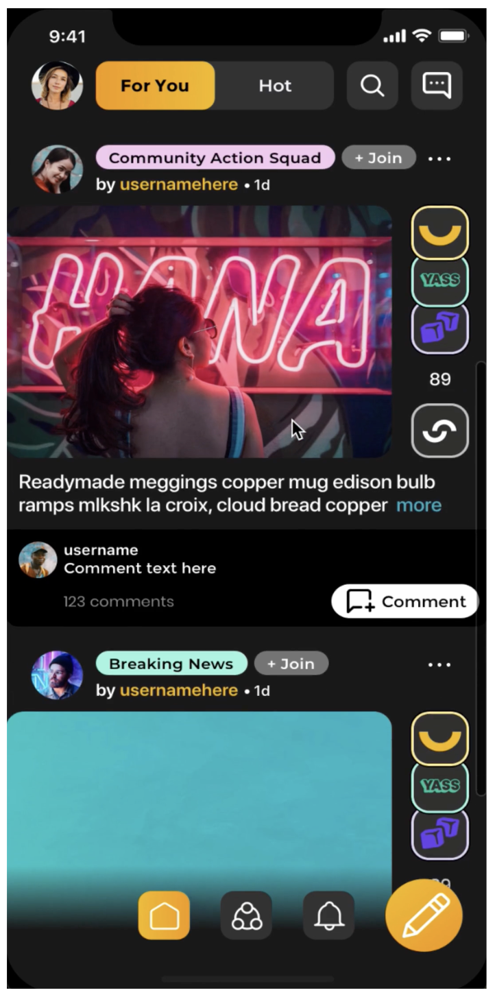
The shipped design surfaces the three most-selected Vibes for each post directly beside the default reaction button, so users can express how a post lands without leaving the feed. The visual treatment is deliberately vibrant — playful color, soft edges, bold sans-serif type — to signal that the platform speaks Gen Z's visual language too, not just its words.
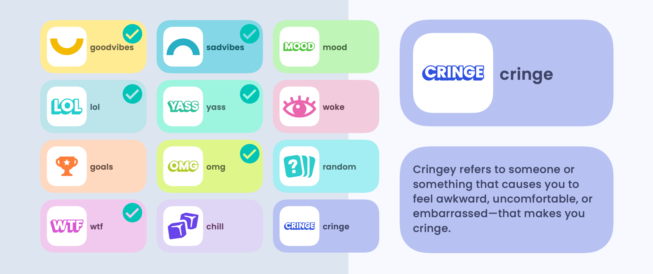
The Vibe cards — playful, on-brand reaction tokens drawn from the audience's own vocabulary (MOOD, WTF, LOL, YASS, OMG…).
Three tradeoffs the system pays for.
A fixed minimum post-cell height keeps the Vibe surface consistent across devices and content lengths — at the cost of some wasted space on shorter text posts. Landscape images get cropped by 11% to preserve a uniform feed rhythm — accepted because the alternative was a jittery, height-varying feed. Small text posts add development complexity to honour the same minimum cell height — a price paid for visual consistency that the audience reads as polish.
Tested before it shipped.
The reworked design ran through a second round of moderated usability testing, then rolled out to 200 internal TestFlight users before the wider release. The same round surfaced accessibility improvements — left alignment for left-handed users, higher-contrast colors, and VoiceOver support — which all shipped with the public release.
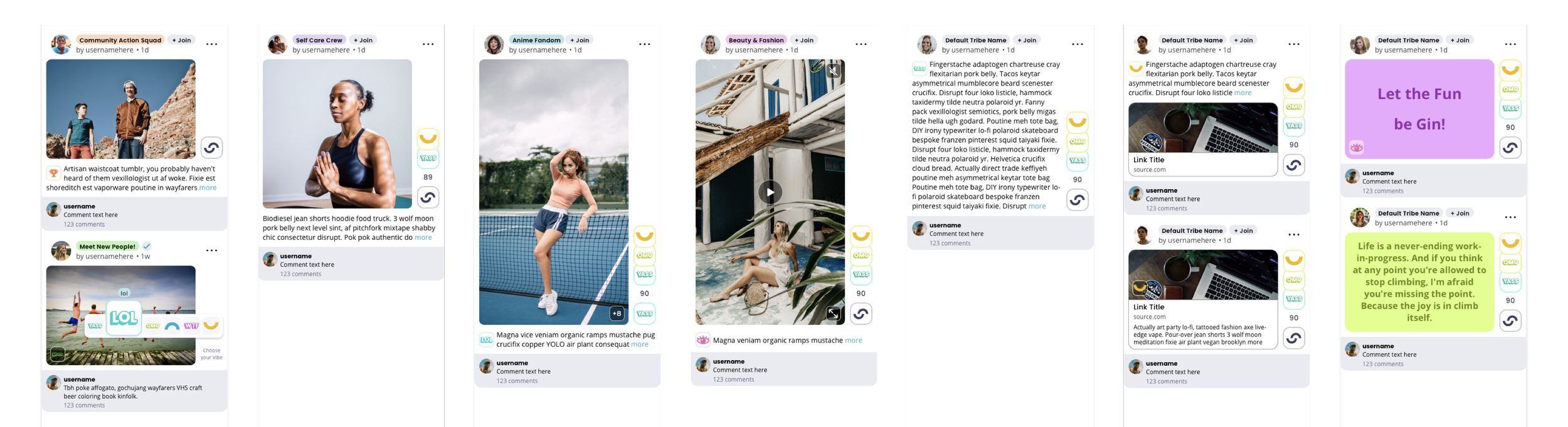
Design deliverables — the handoff package: final mockups, Vibe component library, and accessibility specs.
What shipped, what moved.
Tools and methods.
“The biggest lesson wasn't that Gen-Z language outperforms generic emoji — it was that the audience tells you what to ship if you ask them in their own format. Card sorts answered the design brief the design team couldn't.”