Product design for consumer apps, 0→1 to launch.
From idea to the App Store and Play Store — native iOS/macOS, cross-platform design systems, handed off build-ready in SwiftUI.
Three ways we can work together
Each starts with a conversation — no pressure, just figuring out if we're a fit.
iOS & SwiftUI Design Systems
Native component libraries that cut your dev cycles and kill visual debt — documented, handoff-ready, built to scale.
App Design 0 → 1
A design partner to own your whole product surface, from rough idea to a pixel-perfect app ready to launch.
AI Feature UX Design
AI experiences people actually trust — intuitive flows, transparency patterns, and the messy edge cases handled.
Designed, built, and shipped.
Production apps I've taken from zero to the App Store — design, SwiftUI implementation, and everything in between.
SwiftUI · iOS · macOS · WCAG AA · Usability research
4 apps shipped (1 iOS, 3 cross-platform) — cross-platform design systems, WCAG AA–compliant flows, and moderated usability testing that directly shaped the product roadmap.
SwiftUI · Cross-platform · 1,400+ iOS components · WCAG AA
iOS · SwiftUI · WCAG AA · Consumer

iOS app helping people with diabetes track glucose, carbs, and insulin — reducing cognitive load with a built-in dose calculator and trend analysis.
iOS · Product Design · 2018
Selected case studies.
A preview of design work beyond the App Store launches — explorations across mobile, web, AI features, and brand systems.
Research-led iOS & Android navigation redesign — surfaced core actions in a new Top Navigation Bar, validated by A/B testing.
iOS · Android · A/B Testing · Design Systems
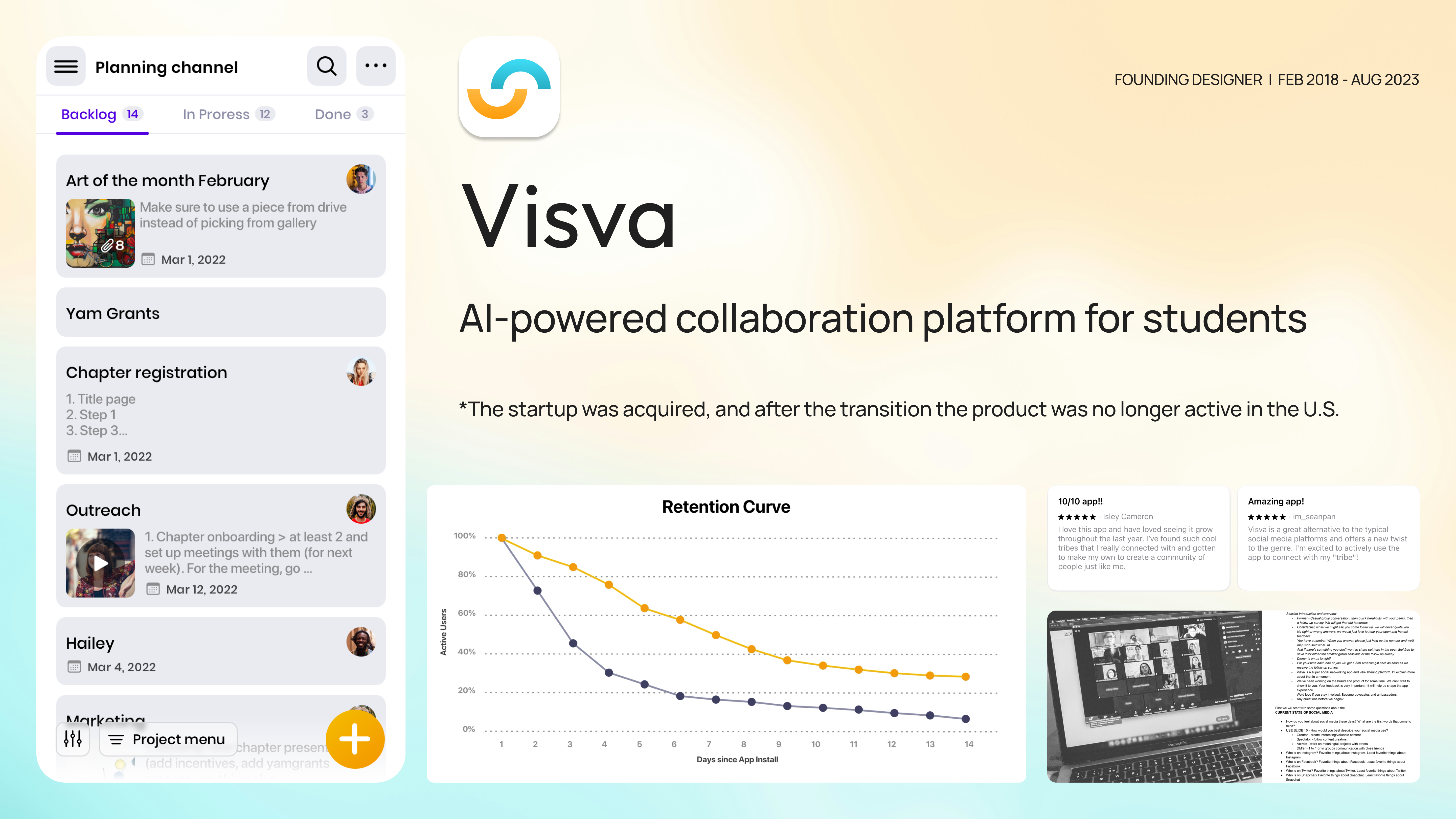
Replaced generic emoji reactions with Gen-Z-native "Vibes" — tripling post-reaction engagement, shortening the AI personalization curve, and raising NPS by 15 points.
iOS · Android · User Research · Gen Z
4,400+ components shipped.
I build design systems that actually get adopted — with token architecture, component docs, and usage specs that reduce dev cycle time by 30%.
Every system ships with token architecture, usage documentation, interaction specs, and edge-case coverage. Not just components — a shared language between design and engineering.
This portfolio's Design System
Shipped AI features people actually use.
I've designed 3 AI features from scratch — embedded with ML teams to translate model capabilities into interactions that feel trustworthy and intuitive.
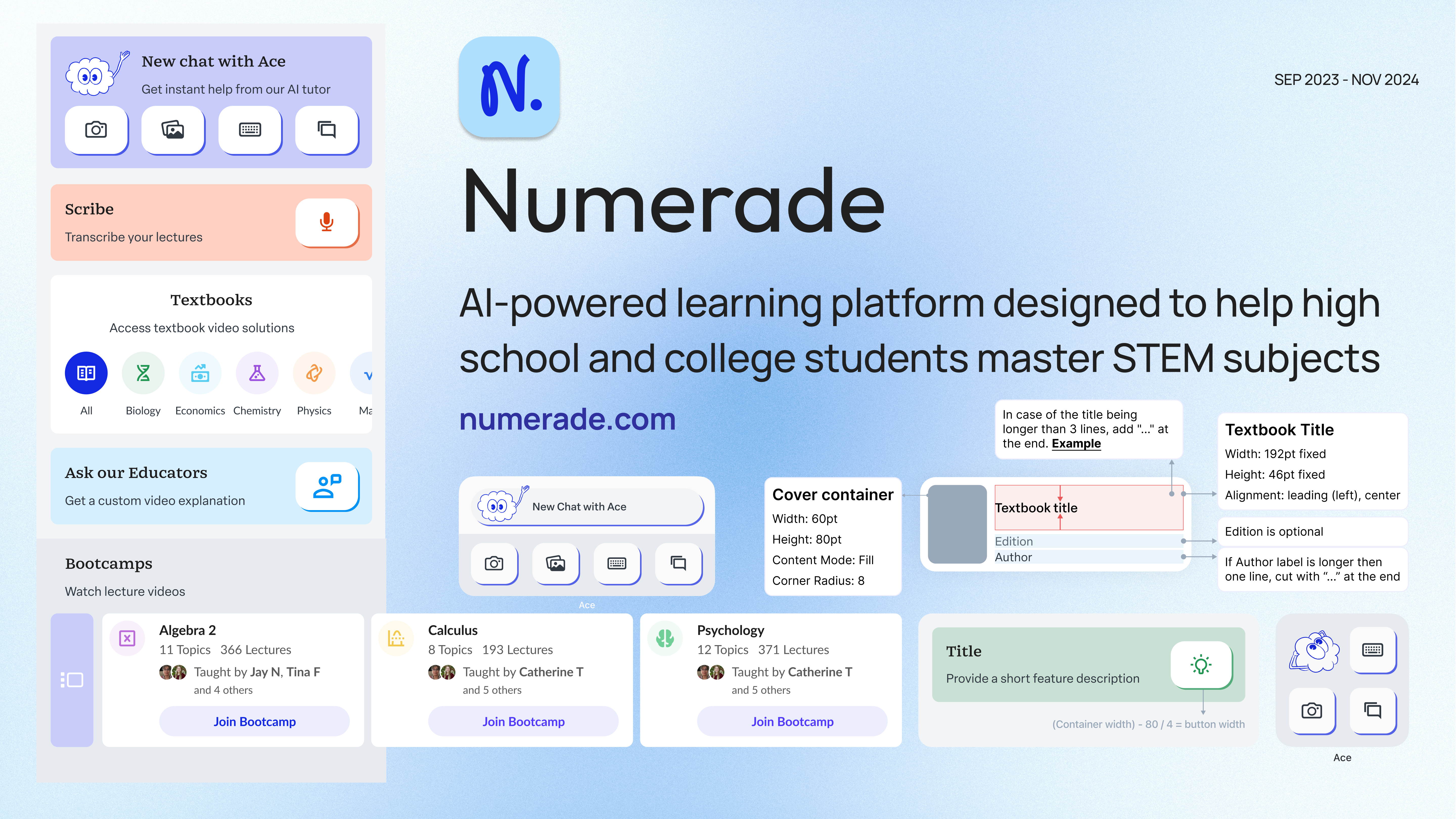
Conversational AI tutoring feature for Numerade. Designed the full UX — prompt architecture, trust patterns, error states, and adaptive feedback loops with the ML team.
Auto-generated study cards from lecture content. Designed spaced repetition UX, smart card prioritization UI, and the full learning flow from generation to mastery.
AI-powered lecture capture with auto-transcription, key concept extraction, and intelligent summary generation. Designed the end-to-end capture and review workflow.
I embed early — before the model is finalized — to shape how outputs get surfaced to users. I design for failure states, uncertainty, and trust from day one. Model capability defines the ceiling; UX defines whether anyone reaches it.
Writing on design, code, and craft.
Thoughts on native iOS design, building design systems, AI/ML UX, and what it means to ship work that actually matters.
How clear principles lead to better design decisions. Two months inside Numerade — establishing product-specific design principles, governing the mobile branch of the design system, and giving designers, engineers, and PMs a shared vocabulary for the decisions that compound across an evolving ecosystem.
Building Numerade's mobile design system: a four-month, cross-functional effort with five engineers and one PM that cut UI-related bugs by 40%, eliminated the dev hours spent hunting specs, and unified the brand across iOS and Android.
Let's Build Something
Available for freelance and contract — San Francisco or remote. Best fit for teams that care about native quality.
Tell me what you're working on and where you're stuck. I'll come back with how I'd approach it and whether I'm the right fit — no pressure, no hard sell.
-
Design Tokens
Color, type, spacing, radii, motion — a single source of truth.
-
Core Utilities & Extensions
Swift helpers, view modifiers, color and font extensions ready to drop in.
-
Reusable Components
Buttons, cards, forms, navigation, alerts — every state covered.
-
Accessibility & Theming
WCAG AA out of the box. Light/dark and Dynamic Type, day one.
-
Previews & Documentation
SwiftUI previews plus an internal usage guide your team can hand off.
-
Final Deliverables
Figma library + production-ready SwiftUI code, side by side.