Improving on Developing Workflows
A four-month, cross-functional effort to unify Numerade's mobile brand experience across iOS and Android — built with five engineers and one PM. The design system that came out of it cut UI-related bugs by 40%, eliminated the dev hours previously spent hunting specs, and made every subsequent feature ship faster.
• Tokens, not components, are the contract.
Build the token layer first — colors, spacing, typography —
and every component downstream becomes maintainable, themeable,
and adaptable without code rewrites.
• Co-design patterns with the engineers who'll use them.
Workshops plus weekly office hours keep the system free of
components no one asked for and aligned with the work
engineering actually ships.
• Documentation is a deliverable, not an afterthought.
If a developer has to ask "what's the spec for this", the system
has failed at that surface.
• Counter-bullet: the 40% bug reduction was
the headline. The bigger win was the meetings that stopped
happening — harder to measure, easier to feel.
Table of contents.
An education platform with a brand spread thin.
Numerade is an AI-powered learning platform helping high-school and college students master STEM. By the time the design-system project started, the product had already grown across web, iOS, and Android — and the brand and user experience had grown unevenly with it. New features shipped one-off; updates didn't coordinate across surfaces; the same UI pattern showed up in three different visual forms depending on which engineer implemented it.
The headline problem was a fragmented brand experience. The downstream problem was worse: engineers spent hours per week hunting for specs, re-implementing components that already existed elsewhere, and shipping features that needed UI follow-up the moment they landed in QA. The velocity tax was real and growing.
Unify the experience, give back the hours.
The fix wasn't a refresh of the visual layer. It was a contract between design and engineering: a shared, versioned vocabulary that named every recurring UI decision once, in one place, and made every subsequent feature cheaper to ship.
“Unify the brand experience across platforms, cut the bug load, and give the team back the hours they were spending on specification archaeology.”
Three moves that earned the 40%.
The system wasn't built top-down. It was built around three specific moves — in this order, with each one earning the next.
-
01
Audit the production code, not the design files
I sat with engineers and walked through the primary user-flows end to end — not the design intent, the actual code shipping in production. The exercise surfaced where components diverged, where the same pattern had multiple implementations, and where the gaps in documentation were costing real development time. That audit became the spec for what the system had to cover, in what order.
-
02
Tokens before components
Every visual decision in the system flows from a token — color, spacing, typography. Components reference tokens, never raw values. Dark mode and per-feature theming become configuration changes instead of forks. The token layer also serves as the cross-platform contract: iOS and Android can implement components differently, but the inputs are the same.
-
03
Co-design patterns through workshops and office hours
Patterns can't be imposed; they have to be agreed. I ran workshops and held weekly office hours with the PMs and engineers to shape the reusable component set together — starting from the audit's pain points and working outward. The bargain was simple: if a pattern earns its place in the system, engineering commits to using it; if it doesn't, we don't ship it. That kept the system from accreting components no one wanted.
Three deliverables, not one.
The system shipped as three things, not one. Components engineering could install, documentation those components pointed back to, and the governance loop that kept both from drifting.
Reusable components and templates
Buttons, alerts, toasts, and forms standardized against the system's principles of inclusivity, clarity, and empathy — every state, every variant, ready to drop into a feature without a designer in the room.
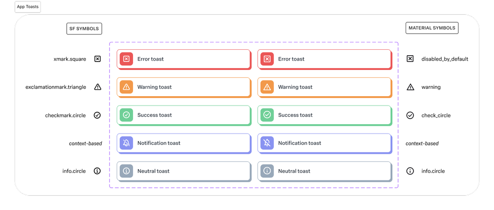
Toast components shipped with every state covered — success, warning, error, info — all sharing typography, color, and spacing tokens.
Integrated style guides and documentation
A single source of truth for typography, color, iconography, and interaction models — so designers, engineers, and PMs could make consistent decisions quickly, without rerunning the same debate every sprint.
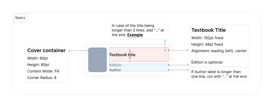
The carousel pattern documented inside the system — usage rules, anatomy, and the conditions that opt designers out.
Feedback loops and governance
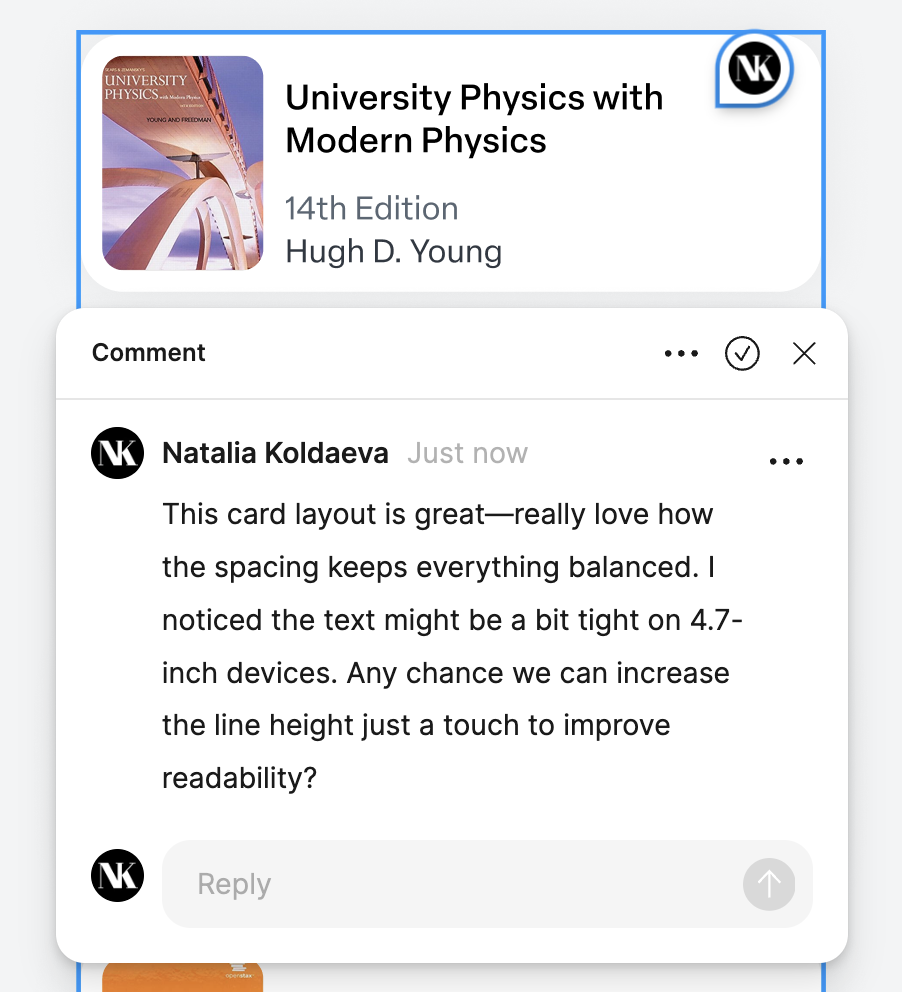
Governance in motion — a component up for review with the principles cited inline as the criteria for inclusion.
A review cadence that evaluated every new component and pattern against the principles — keeping the system from drifting back into the fragmented state it replaced. The library stayed a living, evolving artifact instead of one that froze the day after launch.
Tokens, not components, are the contract. Components without tokens are technical debt with a nicer name — they look like a system but reuse stops the moment a designer needs a half-step variation. Tokens make the half-step a one-line change.
The meetings that stopped happening.
The headline number from this work is the 40% bug reduction. But the one I think about more often is the meetings that stopped happening. The design-spec back-and-forth between design and engineering, the duplicate-implementation conversations, the "which button do I use here" question — those all moved from the meeting room into the system, where they belonged.
The system was validated the way it would be used — by the engineers shipping features with it. Prototypes ran in front of the team, components got pressure-tested against real screens before they were canonised, and the documentation itself was a deliverable engineering reviewed. The goal was zero specification archaeology: if a developer had to ask "what's the spec for this", the system had failed at that surface.
“Components without tokens are technical debt with a nicer name. Build the layer below — colors, spacing, typography — and the components stop being the work, because they become the consequence.”