Designing for Outcomes
Design Process ∙ Design System
How Clear Principles Lead
to Better Design Decisions
Year: 2024
Duration: 2 months
Platforms: iOS, Android
Overview
Leading Mobile Design at Numerade — a platform dedicated to making high-quality STEM education accessible — I faced
The challenge of bringing cohesion and clarity to an evolving ecosystem. Multiple product lines, inconsistent components, and misaligned user interactions had fractured our design language, confusing students, educators, and internal teams. Drawing inspiration from established best practices in defining and leveraging design principles, I embarked on a strategic initiative to realign the design system for native mobile applications.
My goal was to articulate a clear purpose, establish product-specific design principles, and create a robust component library that would serve as a guiding framework for all stakeholders.
The result was a flexible, consistent, and human-centered design system capable of supporting informed decisions throughout the product lifecycle.
Outcomes and Impact
The introduction of product-specific design principles had a profound effect on Numerade’s design culture and outputs.
Consistent Brand Expression
Unified visual and interaction patterns ensured that every product touchpoint—from quick problem-solving features to comprehensive study tools—felt connected, trustworthy, and aligned with Numerade’s educational mission.
Improved Efficiency & Scalability
By formalizing decision-making criteria and providing reusable components, teams reduced the time spent on repetitive UI tasks. This streamlined effort freed us to explore new ideas, accelerating iteration cycles and fostering more delightful user experiences.
Inclusive & Accessible Solutions
Principles emphasizing inclusion and universal access guided all design decisions. Accessibility considerations were woven into the system at every level, ensuring that products reached broader audiences and supported diverse learning styles and needs.
Enhanced Cross-Functional Alignment
A shared language of design principles bridged gaps between designers, engineers, and product managers. With a common framework for evaluating trade-offs, teams collaborated more fluidly and confidently moved forward with aligned, user-centered solutions.
Problem Statement
Before adopting Mobile Design principles, Numerade’s design approach was fragmented. Disparate UI patterns, competing styles, and ad-hoc decision-making had led to:
User Confusion
Inconsistent interfaces and navigation patterns hampered learning experiences.
Reduced Trust
A lack of visual and interaction harmony diluted the brand’s credibility.
Limited Scalability
Teams struggled to adapt quickly to new features, platforms, and audience needs—particularly within native mobile environments.
Goal Statement
The primary objective was to define a purposeful, future-ready design system guided by explicit principles.
Establish a clear mission and purpose statement to inform decision-making.
Create product-specific design principles that would serve as guardrails for every design choice.
Integrate responsive and native mobile components to reach learners wherever they are.
Unify brand and user interface elements into a coherent system that reflected Numerade’s educational values.
Defining Purpose and Principles
Following industry best practices, I began by clarifying the system’s purpose through fundamental questions:
What is the system’s goal?
To empower teams to focus on innovation rather than reinventing UI fundamentals.Why is that goal important?
Without unified guidance, we risk user confusion, lost engagement, and stagnation. Design principles ensure forward momentum anchored by a cohesive brand identity.How will the system help achieve this?
By codifying principles, we minimize guesswork, streamline decision-making, and ensure that each new solution is an intentional extension of our core values.Who is it for?
Primarily internal teams—designers, developers, product managers—who, through well-informed decisions, create better learning experiences for students and educators.
Refined Purpose Statement
To empower students and educators through human-centered, inclusive, and adaptable design. Our design system, guided by product-specific principles, ensures that every interaction with Numerade is accessible, authentic, and impactful.
Establishing Product-Specific Design Principles
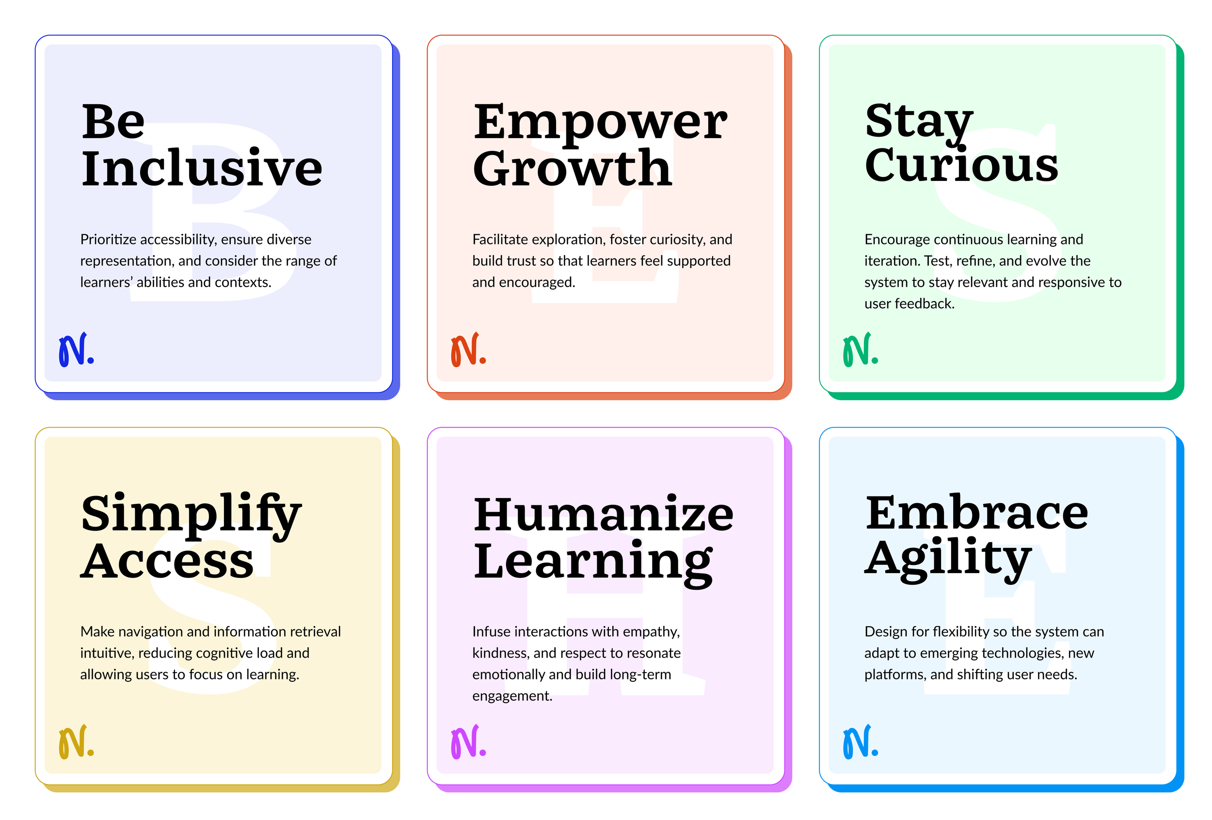
In line with recommendations from user-experience experts, we developed principles that were not only actionable and memorable but deeply reflective of Numerade’s mission and brand identity. Each principle served as a lens for evaluating design decisions.
These principles became a North Star, informing every component choice, interaction pattern, and branding element. When faced with competing priorities or new feature requests, teams referred back to these principles to ensure decisions supported Numerade’s overarching vision.
Mapping the Ecosystem to Prioritize Impact
To ground our principles in reality, I mapped Numerade’s user ecosystem, identifying critical user groups and their key journeys:
Anonymous Users
Casual browsers who engage with quick “Snap Solve” features, often deciding whether to sign up based on their initial experience.
Registered Users
Students and educators who rely on in-depth resources, personalized study paths, and premium tools to advance their STEM learning.
Key Interactions
Anonymous Flows
Quickly capturing and solving problems, receiving solution previews, and encountering clear prompts to join or upgrade.
Registered User Flows
Personalizing their dashboard, navigating structured study materials, engaging with educators, and unlocking advanced features.
Findings
Inconsistent navigation and UI patterns hindered seamless progression from anonymous to registered experiences.
Fragmented visual elements diluted brand recognition and trust.
Weak mobile support compromised learners’ ability to engage on-the-go.
Strategic priorities
High-Value Features
Reinforce Snap Solve patterns and mobile-native components to ensure effortless problem-solving.
Onboarding & Engagement
Provide a smooth, brand-consistent onboarding experience that incentivizes registration and continued learning.
Cross-Tool Consistency
Harmonize UI patterns to deliver a cohesive journey across multiple study tools.
Implementing the Principles and System
Armed with purpose and principles, I created Mobile branch to the design system. It included:
Reusable Components and Templates
Accessible elements standardized to align with principles of inclusivity, clarity, and empathy.
Integrated Style Guides and Documentation
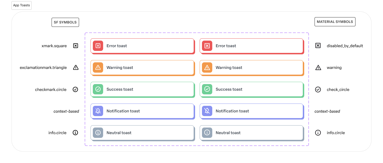
Centralized references for typography, color, iconography, and interaction models, allowing teams to make consistent decisions quickly.
Feedback Loops and Governance
Regularly evaluating new components and patterns against our principles ensured that the system remained a living, evolving entity.
Reflections and Next Steps
By articulating product-specific design principles and realigning our design system accordingly, Numerade’s product teams gained the clarity and confidence needed to make better decisions. Each interaction designed and developed under these guidelines reinforced our mission—making STEM education accessible—and reflected our values of inclusivity, agility, and empathy.
Moving forward, we I continue to:
Solicit user feedback to refine and prioritize new iterations of the system.
Revisit and adapt principles as user needs, educational standards, and technologies evolve.
Champion our design principles as a foundation for consistent, meaningful product experiences that inspire learners and educators around the globe.
In crafting a purposeful, principle-driven design system for Numerade, I demonstrated how carefully defined guidelines can direct decision-making at every stage of the product lifecycle. By aligning teams around a shared vision, we not only improved the coherence and integrity of our products but also delivered on our commitment to serve learners in a truly inclusive, engaging, and impactful manner.


