Navigation Redesign
for Impact
iOS & Android applications ∙ Design System ∙ Information Architecture
Achieving 175% MAU Growth,
Tripling Retention,
and Driving a 70% Revenue Surge
Through User-Centered Design
Year: 2024
Duration: 6 months
Platforms: iOS, Android
Director of Product:
Senior Managers:
Mobile Product Manager:
Mobile Lead Developer:
Engineers:
Researchers:
My collaboration with other roles
Presented the design solutions, highlighting the rationale behind each design decision.
Streamlined processes and implemented strategies that drove measurable results.
Evaluated and prioritized tasks based on impact and ensured resources were allocated efficiently.
Identified opportunities to streamline development by leveraging pre-existing frameworks and reusable elements.
Built solutions efficiently by focusing on understanding all use cases upfront, ensuring we implement it once and minimize rework.
Analyzed existing data to identify patterns and outline potential areas for improvement.
Conducted exploratory research to understand the general tone and needs of users, uncovering deeper motivations and pain points that guided the design process.
Validated effectiveness by using KPIs to measure impact and refine our approach for continuous improvement.
Discovering the Problem
I began by analyzing quantitative data from analytics platforms to pinpoint drop-off points and user behavior patterns, complemented by qualitative insights from user interviews and app store reviews.
I assessed critical flows for usability, design consistency, and performance issues.
I proposed actionable recommendations supported by data and user insights, prioritizing improvements that aligned with business objectives. The presentation was structured to engage stakeholders, including annotated mockups to illustrate potential solutions and a roadmap for implementation.
Complex Hierarchies
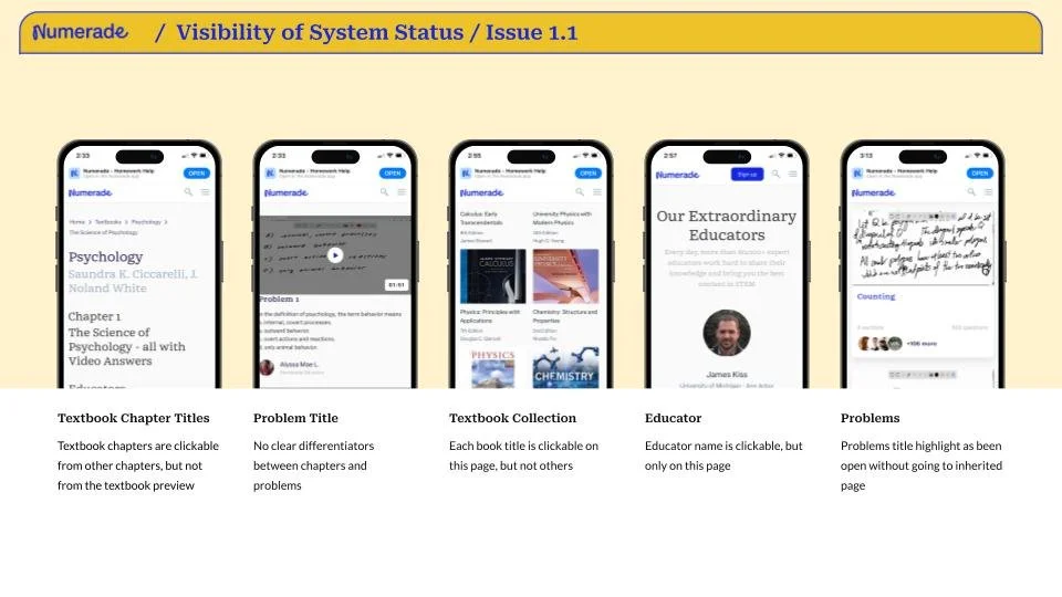
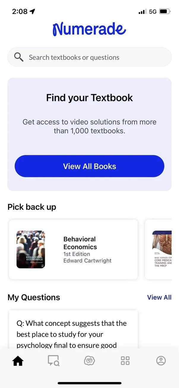
The app’s navigation structure relied on deep hierarchies, making it difficult for users to locate features or return to their starting point.
Guideline Violation
- Material Design: Navigation should prioritize simplicity and allow users to reach destinations with minimal steps.
- HIG: Users should feel in control and always know where they are within the app.
Impact
Users frequently got lost in nested menus, leading to frustration and high drop-off rates.
Lack of Clear Return Paths
Returning to the initial point in the app was unintuitive, with inconsistent “back” behaviors across screens.
Guideline Violation
- Material Design: Navigation patterns should be consistent and provide clear pathways back to the starting screen.
- HIG: “Back” navigation should be predictable and follow standard gestures or visual affordances.
Impact
Users struggled to retrace their steps, resulting in abandonment and diminished trust in the app’s usability.
Overuse of Persistent Tab Bars
The persistent tab bar, visible on every screen, led to redundancy and clutter, causing navigation loops where users revisited the same views unnecessarily.
Guideline Violation
- Material Design: Use persistent bottom navigation sparingly for high-priority destinations and avoid overwhelming users with unnecessary elements.
- HIG: Tab bars should be reserved for distinct, top-level app sections and not persist in contexts where they add no value.
Impact
The excessive visibility of the tab bar caused user confusion, and even app crashes as it did not adapt dynamically to different states.
Insufficient Use of Modal Views
Primary actions and high-impact features lacked dedicated modal views, which could have focused user attention and simplified workflows.
Guideline Violation
- Material Design: Modal components, such as dialogs, should be used for core actions that require focus or immediate attention.
- HIG: Avoid clutter by presenting essential tasks in modal views where users can act without distraction.
Impact
The absence of modals led to distractions, making users struggle to complete primary actions effectively.
Poorly Placed Features
Key features, such as study tools and educator chat, were buried in menus or positioned in non-intuitive locations.
Guideline Violation
- Material Design: High-priority features should be easily discoverable, following visual hierarchy principles.
- HIG: Place features in predictable locations to leverage familiarity and reduce cognitive load.
Impact
Feature discoverability was poor, with users frequently overlooking critical tools or abandoning tasks.
Inconsistent Navigation Patterns
The app used multiple inconsistent navigation methods (e.g., sidebar, tabs, and nested menus), confusing users about how to access features.
Guideline Violation
- Material Design: Combine navigation patterns consistently within an app to create a unified experience.
- HIG: Avoid introducing multiple navigation systems that disrupt flow and create confusion.
Impact
The inconsistency hindered users from developing mental models of the app’s navigation, increasing frustration and errors.
Findings
Engagement
45% of users drop off during onboarding, finding it lengthy and confusing.
Only 25% of users return after their first session, showing low perceived value.
Onboarding lacks personalized content and clear post-onboarding guidance.
Conversion
30% of users abandon the subscription checkout due to unnecessary form fields and unclear error messages.
Many users are unaware of the trial option and hesitate to commit to paid plans.
Feedback
Store ratings are low (Android: 3.1; iOS: 3.2), with frequent complaints about crashes and bugs.
Proactive feedback collection is minimal, with an in-app survey participation rate below 5%.
The Problem
The app is struggling with user engagement and conversion.
Only 24% of users return after their first session, indicating difficulties in navigation and low perceived value.
The Goal
Redesign navigation to make key features easily accessible
[Design]: Simplify navigation structure.
[Goal]: Improve user engagement and ease of use.
[Reason]: Users will be able to quickly locate and utilize important features, reducing frustration and drop-offs.
Navigation Options Considered
Sidebar (Drawer)
Dashboard Style
Hamburger Menu with Categories.
AI Chat Assistant: The default landing page.
My Library: Personalized space for resources.
Ask an Educator: Option to connect with human help.
Bootcamps: View upcoming sessions or join one.
Account: Profile and settings.
Why:
It allows a clean interface by hiding less frequently used features in the sidebar.
Ideal for an app with many features that don’t need to be constantly visible.
Provides room for future scalability (e.g., adding new features).
Home Dashboard: with quick-access tiles
Persistent Navigation: Top and bottom bar with shortcuts to Dashboard, AI, Library, Profile
Account: Profile and settings.
Why:
Presents all core features in a single glance, reducing clicks.
Great for users who benefit from an overview of all options on launch.
Highly customizable based on user activity and preferences.
Step-Driven
Each tab offers step-driven options tailored to its purpose.
Learn: Access AI assistant and personalized content library. Recently solved problems, textbooks.
Solve: Direct pathway to AI chat for problem-solving or submitting queries. Open chat with AI or view recent chat history.
Connect: Ask a human educator or join bootcamps. Educator chat or bootcamp schedule.
Account: Profile and settings.
Why:
Creates a structured, logical flow for users who follow specific tasks.
Keeps the interface clean while guiding users toward what they need.
Suits task-oriented users who prefer segmented options.
Deciding on the approach
Considering all possible options to approach the Navigation changes, I conducted a Competitor Analysis and discussed it with the team.
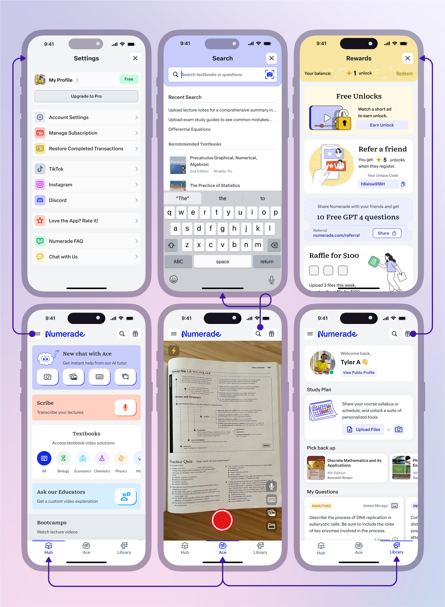
Collectively, the team decided to move forward with Dashboard Style, putting the primary AI-assistant feature as the default view, reducing the number of steps users need to accomplish before getting a solution from 7 to 3.
Why is this better than the alternative?
Tab-based Navigation works best if the app prioritizes easy access to frequently used features like the AI assistant.
Dashboard Style offers a modern, flexible approach for users who need an overview of all available tools at once.
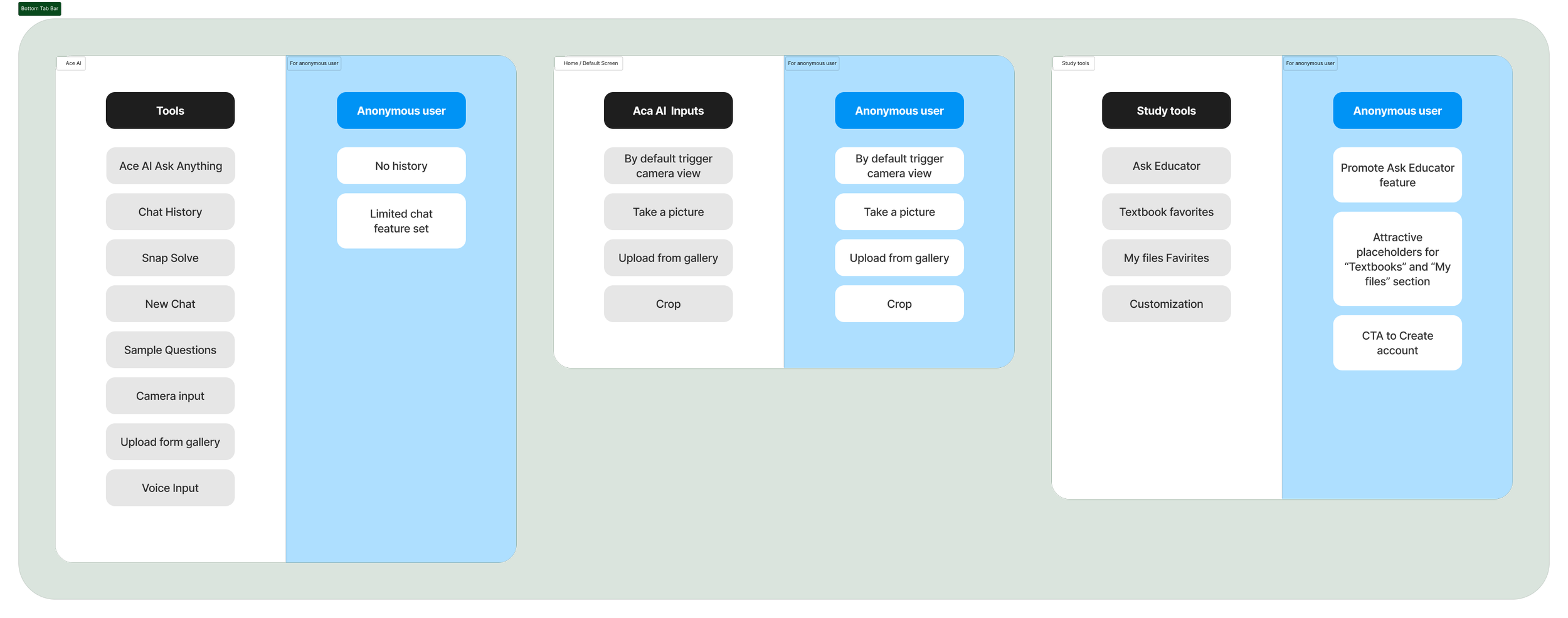
Aligning information architecture (IA)
with the user journey
I created information systems that are user-centric, scalable, and adaptable to the evolving needs of their audience.
Onboarding IA
Top Navigation Bar IA
Bottom Tab Bar IA
A/B Testing of Proposed Navigation through Interactive Prototype
These results strongly indicate that the proposed navigation enhances usability, reduces user friction, and aligns with user expectations, providing a solid foundation to move forward with the design.
Many participants suggested only minor tweaks (e.g., icon size adjustments) and appreciated the clean, modern dashboard view and the default camera screen.
Increased Efficiency
Time on Task: Users completed tasks 30% faster compared to the current navigation.
Success Rate: Task completion without assistance rose to 85%, up from 68% with the current design.
Reduced Errors
Users encountered 40% fewer navigation-related errors, particularly in accessing key features like the AI Assistant and My Library.
Improved User Sentiment
Feedback: 90% of participants found the proposed navigation intuitive and appreciated the simplified structure.
Users frequently noted how quickly they could locate features, particularly while exploring tools.
I selected a mix of existing users and new users. For onboarding improvements, I included individuals unfamiliar with the Numerade app.
I used the prototype alongside the current navigation in a real-world scenario to compare performance.
I designed with flexibility in mind
I delivered a seamless redesign while keeping the apps operational and maintaining user trust.
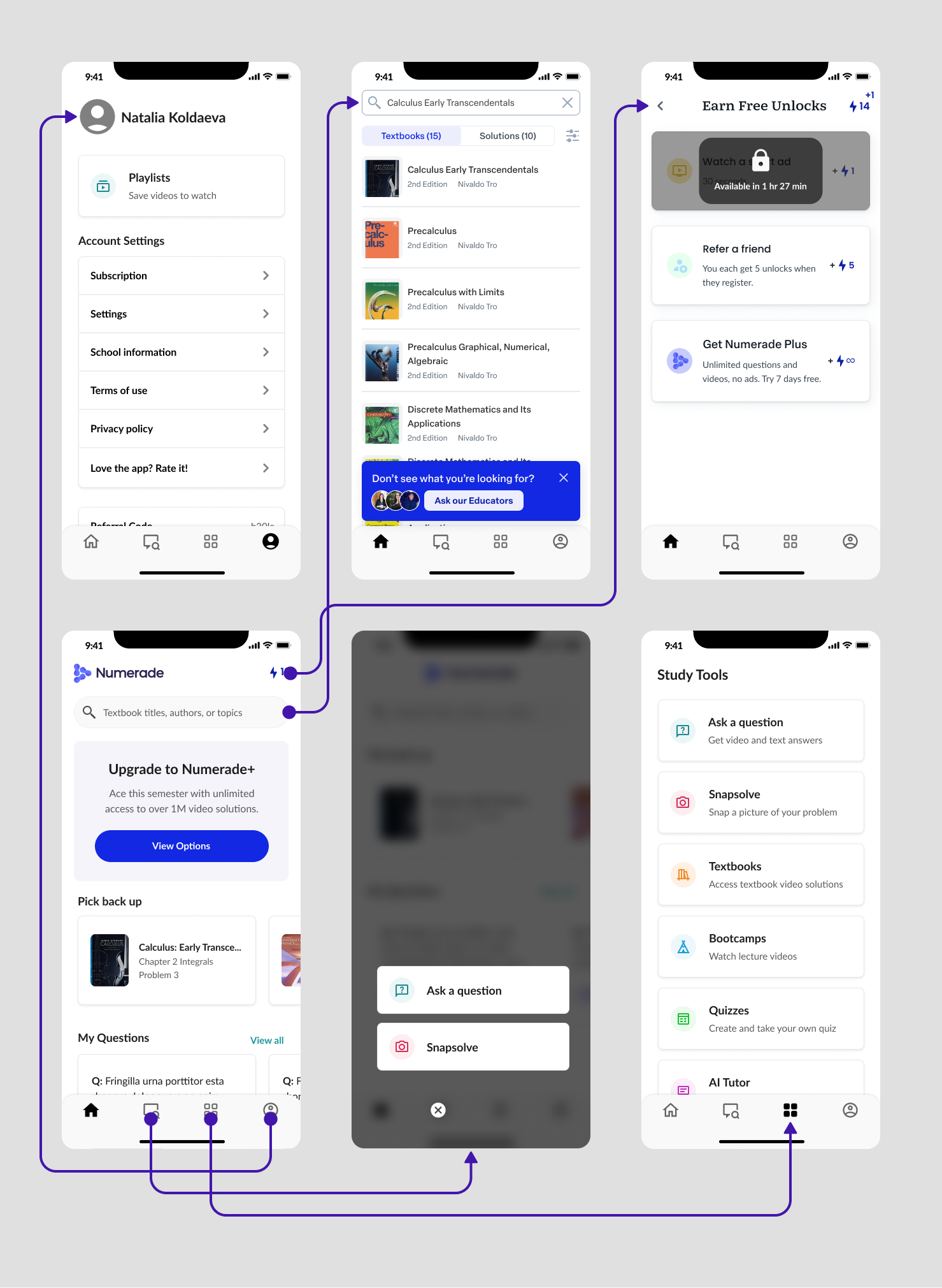
Home: Before the Redesign Project
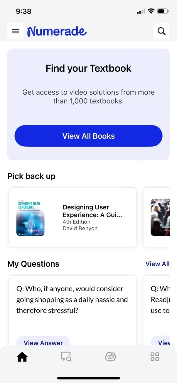
Home: Release of Top Navigation
Phase 1: Introducing Top Navigation Bar
I focused on unifying the app's navigation experience to further streamline user flow and reduce cognitive load. By introducing a consistent top navigation bar,
users now have immediate, intuitive access to critical functions like settings, profile, and a global search—available from any screen within the app.
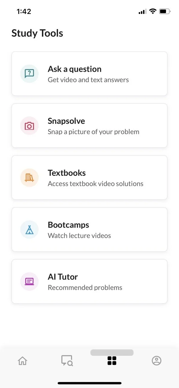
Decluttered "Study Tools" view
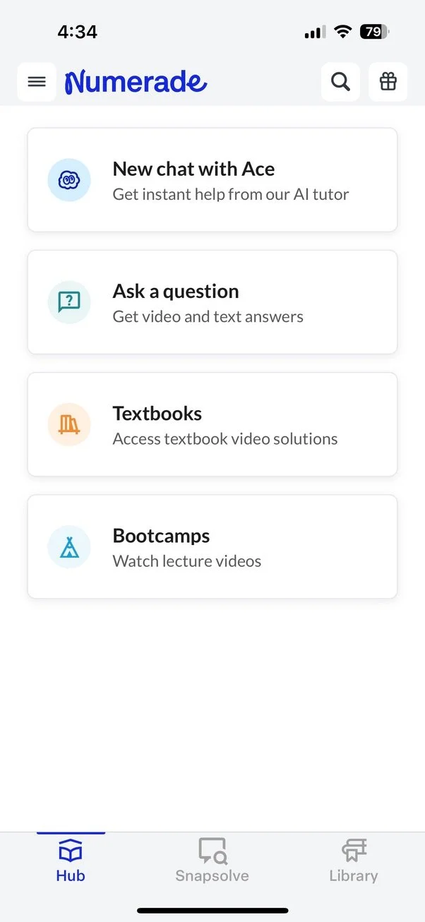
Integration of “Study Tools“ into Hove view
Phase 2: Integrating core actions directly into the home view.
In the second phase, I streamlined the "Study Tools" view by decluttering and consolidating essential tools into a clear, single-scroll layout.
With validation from our user behavior analysis, we streamlined the navigation further by integrating core action buttons directly into the home view.
This adjustment reinforces our assumption that users benefit from immediate access to essential tools, making the experience faster and more intuitive.
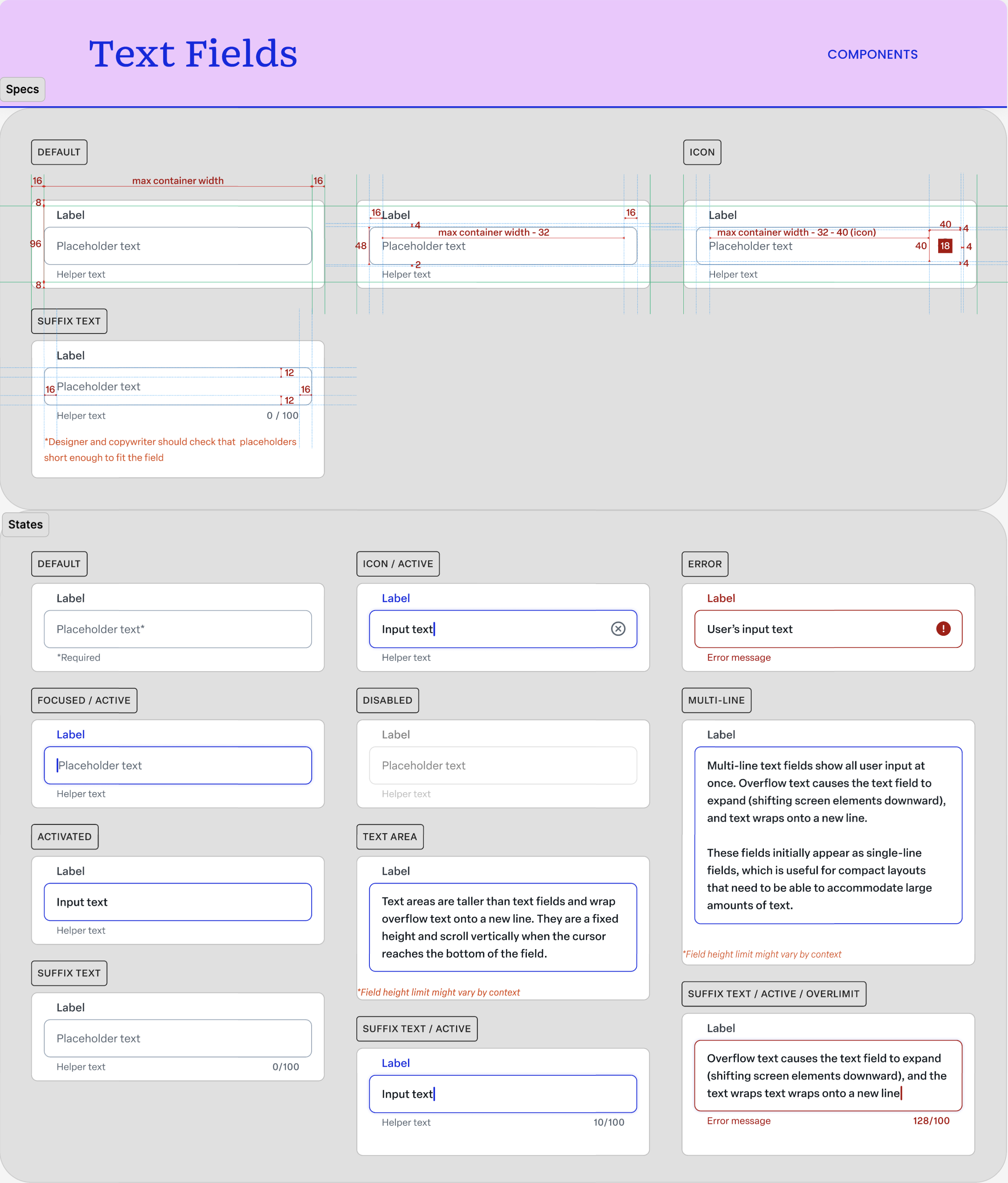
Phase 3: Developing Design System
I established a dedicated Figma branch exclusively for the mobile app, allowing for easy collaboration and iteration.
Clear documentation was provided for each component, detailing its use cases, states, and differences in behavior across platforms.
Every section and component was discussed extensively with the engineering team to ensure feasibility and alignment with existing frameworks.
We prioritized creating components that minimized custom development time by leveraging pre-existing code libraries and reusable design patterns.
New designs were tested with small user groups to validate usability and consistency.
Components were iteratively refined based on user feedback to address any usability gaps or aesthetic misalignments.
Accessibility standards were prioritized by adhering to WCAG guidelines, ensuring all components were legible, navigable, and usable for a diverse audience.
Impact:
The design system significantly improved team productivity by providing a shared reference point for designers, engineers, and stakeholders.
Consistency across the app enhanced the user experience, fostering familiarity and trust among users.
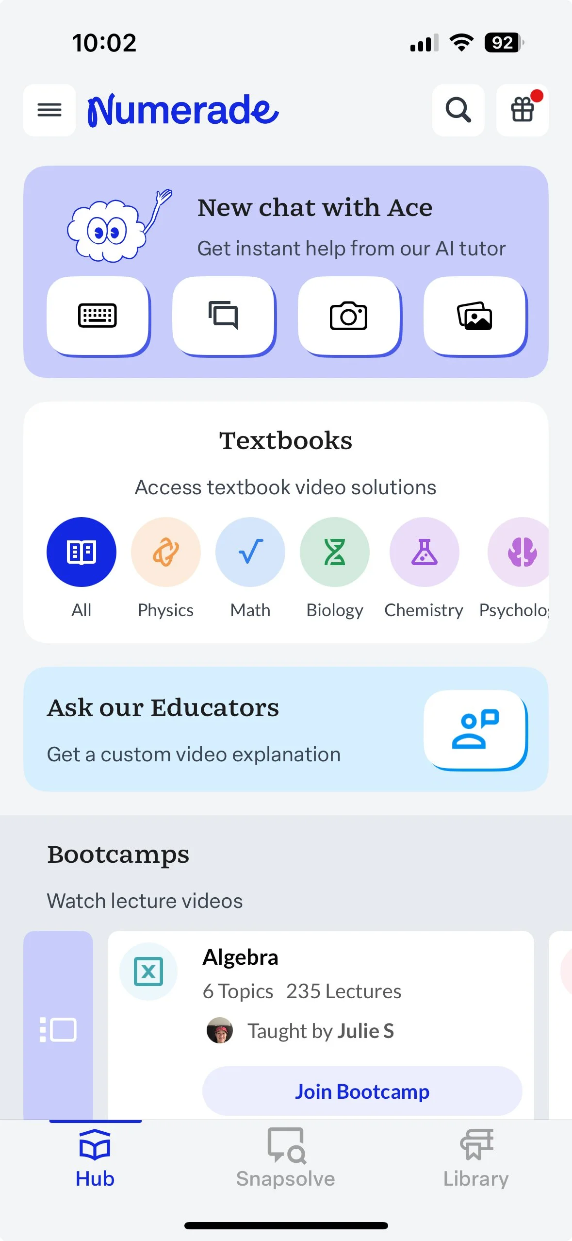
Numerade: Home View
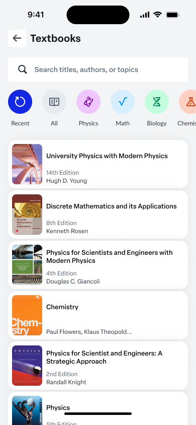
Numerade: Textbooks View
Phase 4: Introducing Brand Personality
I reimagined the home view to highlight the brand’s personality while creating a visually engaging interface that fosters long-term loyalty.
Impact:
Increased time spent on the home screen as users explored feature previews, driving deeper engagement with the platform.
Highlighted features, such as textbook filters and Bootcamp details, saw a notable rise in user interactions, validating the appeal of these previews.
The vibrant and personalized design elevated user satisfaction and fostered a sense of belonging, contributing to higher retention rates.
By showcasing platform highlights and actionable content, users were able to uncover the full value of the app, reducing drop-offs and increasing feature adoption.
The refreshed design made the app more memorable and distinctive, creating a strong association between the interface and the brand’s commitment to quality education.
Numerade: AI assistant Ace
Numerade: Personal Library
Phase 5: Redesigning Feature-by-Feature
This phase represents a comprehensive initiative to overhaul the application’s entire feature set, employing a methodical, user-focused approach to deliver consistent, engaging, and high-performing experiences across all touchpoints. The primary objective is to extend the design principles and practices established in earlier phases, ensuring uniformity and usability throughout the platform.
Incremental Redesign of Core Features:
Each feature was analyzed and redesigned individually, addressing user pain points, improving usability, and aligning with the overall design system.
Built with scalability in mind, the designs accommodated future feature additions without requiring major redesigns.
Worked closely with engineering, product management, and research teams to ensure each redesign was technically feasible, aligned with user needs, and met business objectives.
Addressed inconsistencies in legacy designs, resolving discrepancies in user flows and interface elements.
KPI Metrics for Navigation Redesign Project
Engagement
Objective: Increase app stickiness and long-term user engagement through a seamless navigation redesign.
Monthly Active Users (MAU):
Achieved a 175% increase in MAU, growing from 60k to 165k within six months.
Measurement: Tracked through analytics tools to monitor active user growth across iOS and Android.
Retention Rate (7-Day):
Boosted 7-day retention from 1.4% to 4.5% by reducing drop-offs through improved navigation and engagement-focused features.
Measurement: Percentage of users returning within seven days post-download.
Daily Active Users (DAU):
Sustained DAU growth in line with MAU increase, with a DAU/MAU ratio of 30-40%, reflecting consistent daily engagement.
Time Spent per Session:
Increased average session duration by 20% as users find value in key features like AI Tutor, Textbooks, and Bootcamp.
Feature Usage Rate:
80% of users use high-impact features (e.g., AI Tutor, Textbooks, and Bootcamp.) within their first three sessions.
Conversion
Objective: Streamline onboarding and subscription flow to increase revenue and drive paid subscriptions.
Onboarding Completion Rate:
Achieved a 90% onboarding completion rate, ensuring users transition smoothly into core app experiences.
Subscription Checkout Conversion:
Increased subscription conversion rates by 50%, contributing to a 70% surge in mobile app revenue within six months.
Trial-to-Paid Conversion Rate:
Improve trial-to-paid conversion by 70% through clearer trial options and a frictionless checkout process.
Revenue Contribution:
Increased the app's revenue contribution to overall company revenue by 112%, demonstrating the redesign’s financial impact.
Feedback
Objective: Enhance app ratings, user satisfaction, and customer support to reflect improved user experience.
App Store Ratings and Reviews:
Raised ratings from 3.1 to 4.0 on Android and from 3.2 to 4.4 on iOS by implementing user-centered design and addressing user pain points.
Measurement: Monitored monthly to track trends in user feedback and satisfaction.
Survey Participation Rate:
Increased in-app survey participation to 15% by introducing non-intrusive feedback prompts.
Net Promoter Score (NPS):
Achieved an NPS of 60+, reflecting increased satisfaction and user loyalty.


