

Designing for Efficiency

iOS & Android applications ∙ Design System ∙ Information Architecture
By investing time upfront in a design system, the mobile team saves 30% of the total project hours, equivalent to 1,206 hours and $144,720 in a year, while also improving quality and scalability.
Year: 2020-2021
Duration: 12 months
Platforms: iOS, Android, Web
Role: Product Designer
Overview:
The Visva Design System established a scalable, cohesive design framework that improved internal efficiency, ensured brand consistency, and enhanced the user experience. This initiative streamlined design and development processes, saving 30% of project hours annually—equivalent to 1,206 hours and $144,720—while ensuring high-quality, scalable designs that resonate with teen audiences.
Goals and Challenges:
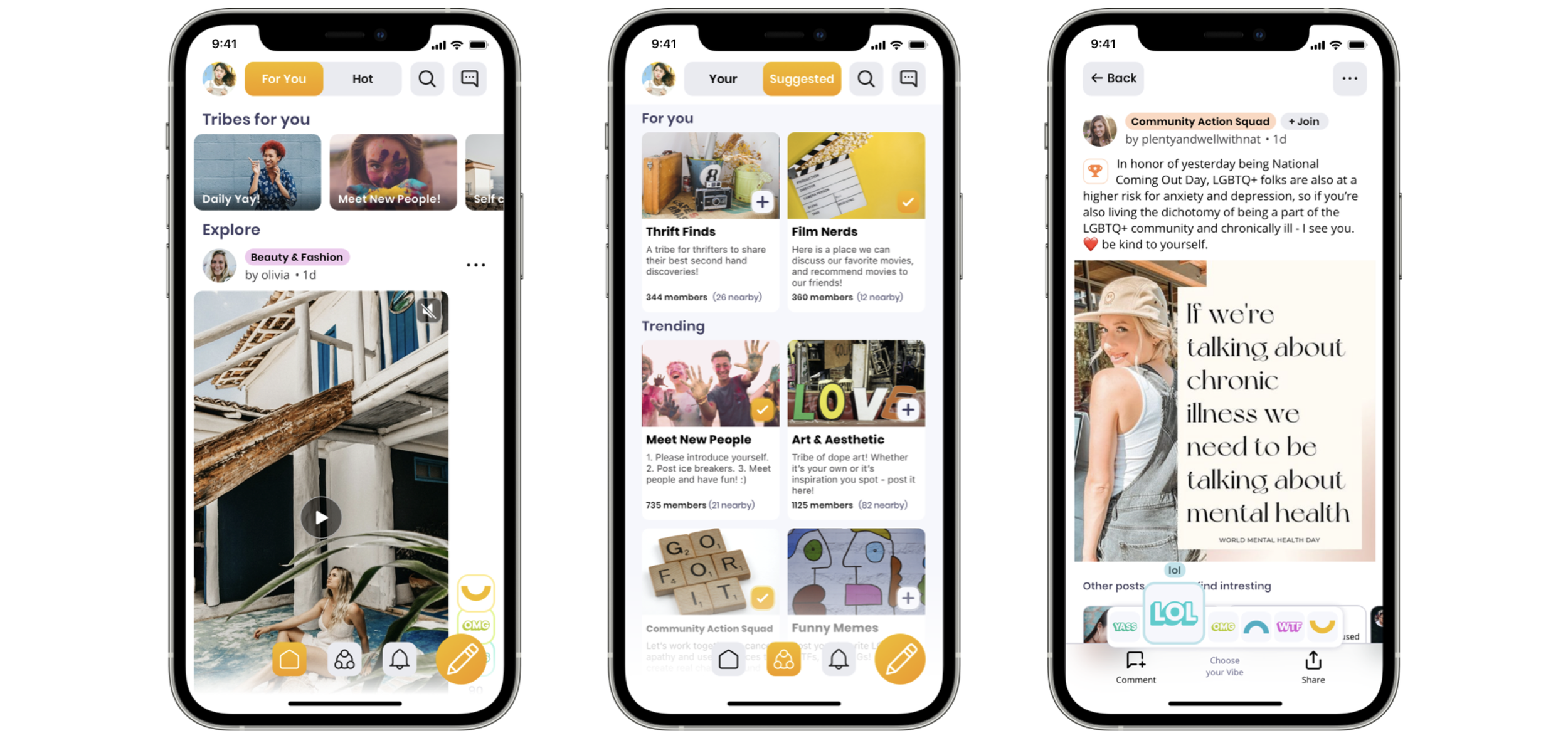
In the early stages of the Visva redesign, I struggled with the new demands for the new visual brand language to be consistent across all platforms and simultaneously be flexible and adaptive. I approached it with a system and defined design patterns early on. As with any product design process, I was creating it to fit into the workflow of users - other team members. The redesign of the Visva platform demanded a new visual brand language that was:
Consistent across all platforms: Ensuring seamless branding and usability across mobile, web, and desktop environments.
Flexible and adaptive: Supporting the evolving needs of teens, who prioritize relatability and emotional connection in their apps.
Efficient for teams: Enabling designers, developers, and product managers to collaborate effectively within a unified system.
I analyzed the key screen of a redesigned product to see how many unique colors, font sizes, and font families I have. It was a great way to see where I could merge or remove some variety initially, not to blow the design out.
Process
Design Inventories
To establish a solid foundation, I created two inventories.
Visual Attributes: Organized colors, typography, and spacing into a codified visual language.
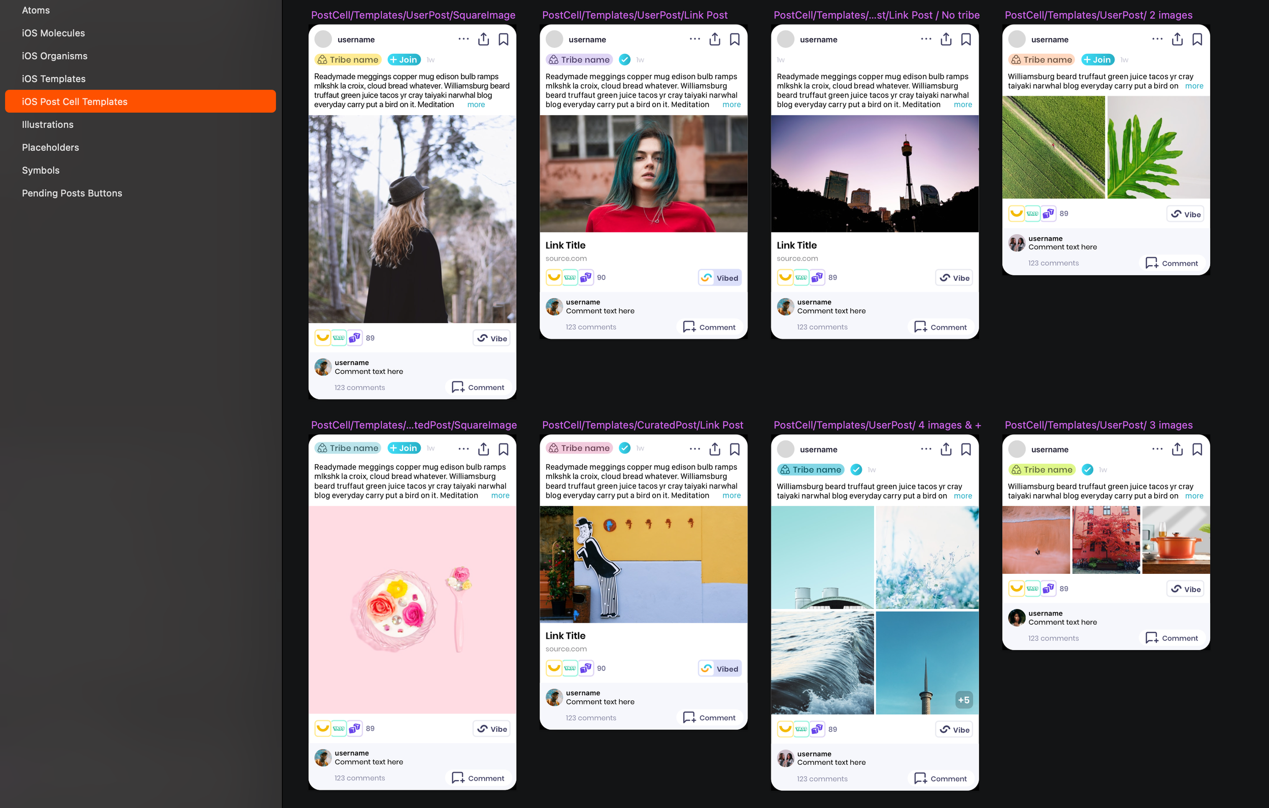
UI Elements: Cataloged reusable components such as buttons, cards, and modals into a comprehensive library.
Design Kit Creation
Developed and maintained a design kit in Sketch that included:
Components, Styles, and Symbols: Standardized for all platforms.
Design Tokens: Used to abstract design properties (e.g., colors, spacing), ensuring consistency and simplifying updates.
Accessibility and Collaboration
Collaborated with cross-functional teams to ensure the system was accessible and met WCAG standards:
Developers: Created modular, efficient code linked to the design system.
Content Strategists: Maintained a relatable tone and voice for teens.
Product Managers: Aligned the system with business goals and customer needs.
Atomic Design Principles
Structured the component library into four levels:
Atoms: Standalone elements like buttons and icons.
Molecules: Groups of elements, such as search forms.
Organisms: Larger sections, such as navigation menus.
Layouts: Arrangements of components across pages.
Solutions
The Visva Design System provided
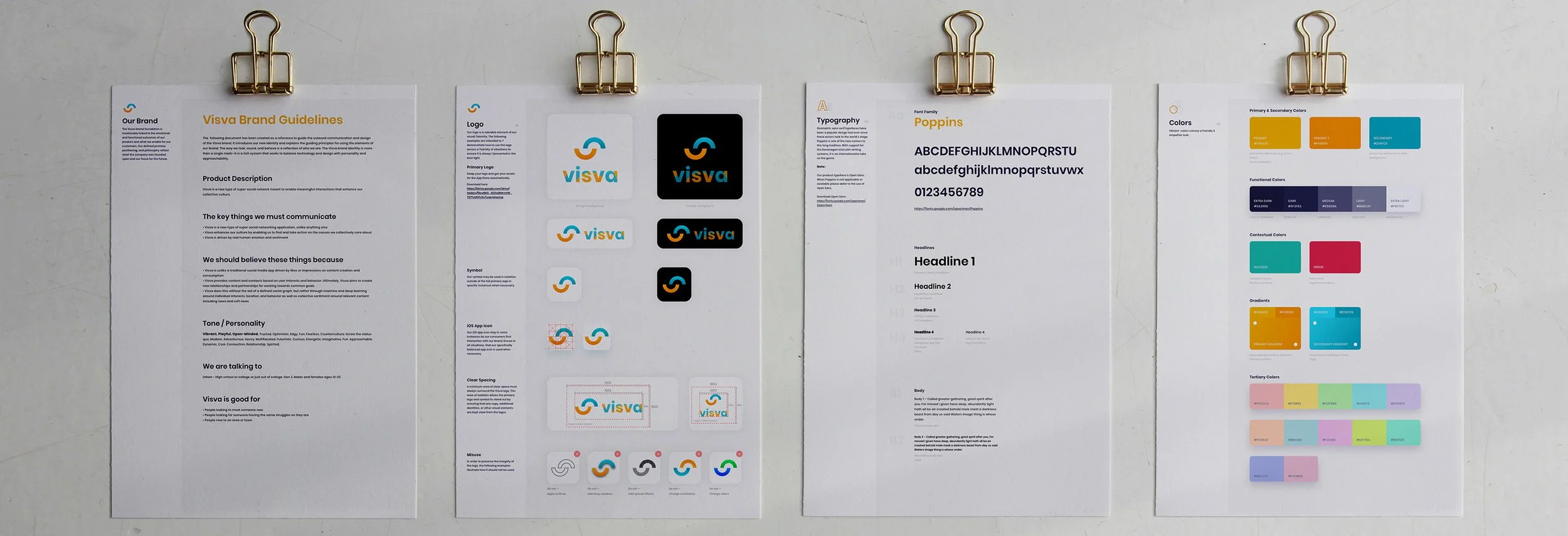
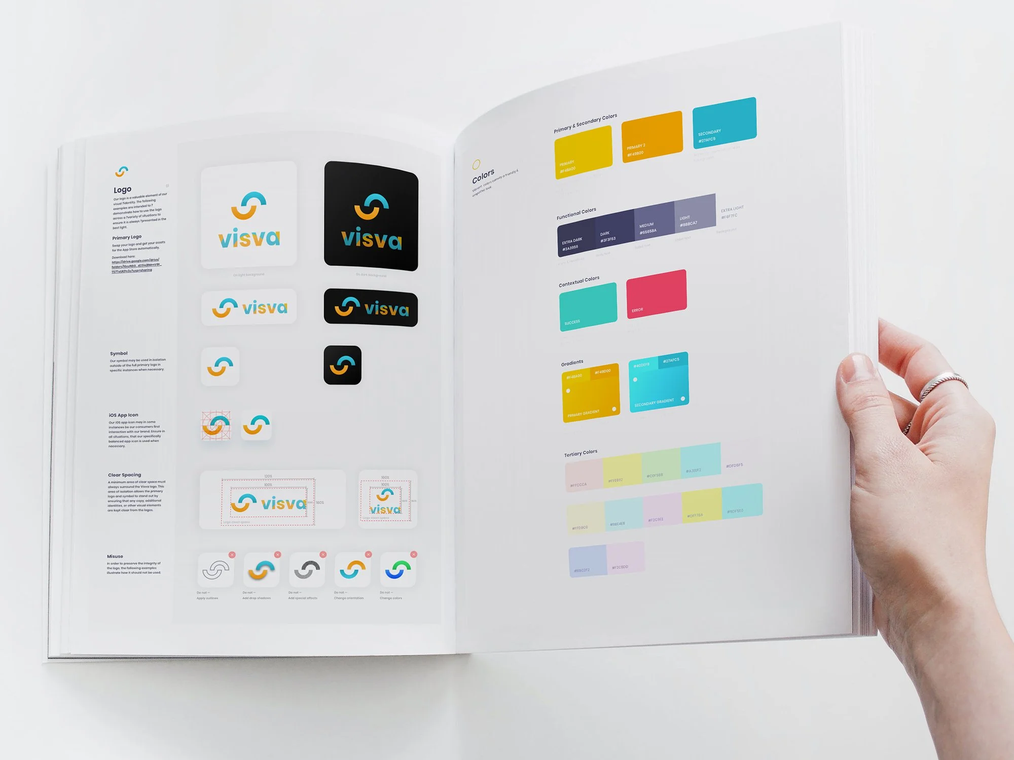
Colors
Turquoise and yellow for branding and interactive elements.
Neutral palettes for backgrounds and borders.
"Vibes" colors to represent emotions while maintaining accessibility for colorblind users.

Typography
Standard system fonts (San Francisco for iOS and Open Sans for web) for text bodies, prioritizing legibility and accessibility.
Custom web font Poppins for headings, reflecting brand personality while minimizing performance issues.

Icons & Illustrations
Custom-designed empty-state and loading illustrations, which added personality and visual interest.
Utility and action icons (like settings, notifications, etc.) are SF Symbols Font 1 color icons are multicolored and more creative.

Component Library
Defined reusable patterns and components in Zeplin, enabling seamless communication between teams.
Impact
The design system resulted in significant improvements:
Efficiency Gains
Reduced design and development time by 30%, saving 1,206 project hours and $144,720 annually.
Time Estimates (Hours)
Without a Design System:
Design Time per Screen: 6 hours for basic design + 4 hours for unique components and styling = 10 hours/screen.
Development Time per Screen: Between 8 and 32 hours (average: (8+32)/2=20(8+32)/2=20hours/screen).
QA Time per Screen: 4 hours/screen.
With a Design System:
Design Time per Screen: 6 hours for reusable screens; unique screens remain at 10 hours.
Development Time per Screen: Reusable components reduce dev time to 4–12 hours (average: (4+12)/2=8(4+12)/2=8 hours/screen).
QA Time per Screen: Reusable components simplify testing, reducing time to 2 hours/screen.
Time Saved
Time Saved=Time Without DS−Time With DS
4,658−3,452=1,206 hours
Cost Savings
Cost Savings=Time Saved×Hourly Rate
For $50/hour:
1,206×50=60,300 USD.1,206×50=60,300USD.
For $120/hour:
1,206×120=144,720 USD.1,206×120=144,720USD.
Consistency
Established a unified visual language that minimized design discrepancies and errors.
User Engagement
Enhanced usability and emotional connection for teens through relatable and accessible design.
Team Productivity
Improved collaboration across design, development, and product teams by providing a shared framework.
Learnings
Iterative Approach
Starting with a smaller scope (focusing on key UI elements) allowed for faster implementation and iterative improvements.
Collaboration
Engaging stakeholders early ensured alignment with both business and user goals.
Accessibility Focus
Prioritizing WCAG standards from the outset reduced the need for costly retrofits later.
The Visva Design System was a transformative initiative that streamlined internal processes and elevated the user experience. By creating a scalable, cohesive framework, we ensured Visva could adapt and grow while maintaining quality and consistency.
This project exemplifies how investing in foundational systems yields long-term benefits for both the business and its users.